30 January 2014

Unfinished Business

I am currently in the middle of several concepts, so I am working hard to get them all done. Keep in mind that some of them do not need to be completed immediately anymore. I will see if I can have them up soon, but I don't have anything up for you at the moment. That means more to anticipate tomorrow!

-Ricky

29 January 2014

It's Here, Asymmetrical Royalty

The only featurette today is my most recent addition to my collection. I almost had both pre-Edge and Edge versions by mistake, but made sure I got the right one. The hem and mesh make this one that much more appealing unlike that another jersey ruined by the Edge era uniforms.


I will be working on more of course, and soon may make a business out of it. Until then, it's not quite a long way off. But it is a real trophy in my collection, there we can't disagree (can we?). While I continue to look for more. Share your most wanted jersey of all time if you wish everybody has one - at any level of sport (even the Hollywood version - eg: Slapshot, etc . . .). Well I will be back to write again soon!

-Ricky

28 January 2014

Sleeves and Basketball

While there generally hated by the players, nobody really knew what the fans though until now. I was raoming around Bleacher Report and found a poll for fans on which I participated. While I personally generally like them, they have their faults. My findings to that point as of a few minutes ago are as follows.


I voted for the third option. I would say the last as a jersey enthusiast, but never before I bought one from my team (in this case Indiana) who does not currently have one. Much less, I don't own an NBA jersey - that gold 90s pinstriped Reggie Miller jersey still eludes me. I had an idea before the pole of the hatred among fans, but this actually seems high  as far as people who like it. The first option is the only true no and I considered the remaining answers as yeses. If these had multicolored crest logos, then I'd be 100%, of which I'm between 85-95% right now. I am appreciative that this year's sleeves are slightly longer from the jerseys used last year. The only ones that look bad this year are the ones for the All-Star Game in New Orleans, but it's because of the poor branding of the event, not the jersey itself.

Well, I'm out and feel free to leave your opinions below!

-Ricky

27 January 2014

Lacoste of it All

I was browsing the Lacoste website as the Australian Open has just wound down and discovered a semi-annual sale. I currently own products from their fragrance line and their home line. I found a nice sweatshirt, but it wasn't even a little on sale. I also took down their (male's) size chart (sorry, ladies) for my personal benefit, but I figured to put it up here anyway. I also found something with a jacquard pattern that I had ought to make a template for for future uniforms.


As for the near future, yet another jersey has been shipped . . . it will for sure be here today or tomorrow, which means you'll see it tomorrow or (presumably) Wednesday. I had found it on Friday after that post so I didn't get to tell you about it. You may or may not be surprised. I'll see to it that there are pictures from Springfield College club hockey opponents uniforms be up soon as well as their final home opponent on Sunday maybe after their Friday night game at 10PM against Norwich, yes 10PM EST. That apparently was the only ice time available and Norwich will be getting home near 4 AM maybe and there probably will only be one ice cleaning if any between one of the intermissions. Yours truly will be the PA guy for one final time unless we get a home playoff game. In the meantime, look forward to the next few days.

-Ricky

26 January 2014

The Sun is a Mass of Incandescent Gas

I took the liberty to go back to a dark era in Coyotes history: the Acid Trip jersey. The jersey so got it's name because the desertscape featured on it was so despised by the general public. Those days are well gone, but it is stuck in our minds forever.


While I did not use the original background for the hem and cuffs, I did use it for the background but with the current color scheme. I used the state rays that were incorporated in the alternate logo instead. Granted the hem shouldn't be so high up, I was going based on the crest logo positioning.


With color rearrangement, I decided to put the desertscape to see how it would look and it looks better just because it is a little less crowded despite being more specific to detail. This color scheme, however, is much more easy on the eyes.

That's all I got on this Sunday afternoon, I'm Ricky Mazella. I'll see you on the radio.

-Ricky

25 January 2014

HCI: Post IX

*** The following is my post from a different site, please visit hockeyconceptideas.blogspot.com for the article. ***

 . . . And My Man J-Roney

You'll find this in Whoomp, There it is: "That's me, DC - and my man Steve Roney!" Well, not quite. I'm not DC and his name is Jeremy, not Steve. But our concepts are featured here today. One aspect of my posting over time is that I don't have a bias to any team other than the Ducks, however I do endearingly (as a hockey enthusiast) mock team nicknames (the Strangers, the Lames, etc . . .) so please don't take them as such. Elsewhere I'm getting really excited over that big win to get the Ducks back on good terms at home.

Playstation 4
Submitted by: Jeremy Roney

The new Playstation 4 was something I thought that Sony would not pursue a yet here we are. Considering it's a heavy part of the branding, I am somewhat surprised that more gradient isn't used here. The only thing that really irks me is the disproportionate number and name. As for the front number, bring it down and towards the center a little. But I am pleased with the result, it is certainly unique from anything I have seen.

Vancouver Canucks
Submitted by: Ricky (Me)

This was the first of the currently available and to be produced in my retro-modern series. A twist on an old classic. The classic being the gradient and tick just to the current color scheme and the twist being Johnny Canuck. Since his number had been recently retired by the Canuckleheads, I used Pavel Bure to "model" the jersey (if you will). Again, this series is to be accurate in some areas (application of design) while adding new elements (change of color and number layout {not font or logo necessarily}). Because it is a retro-modern series, every jersey will feature one thing that the originals did not have: lace-up collars. The Lace-up collars are intended to further imply the "retro-ness" of the jersey. As for the jaggedness of the tick lines, I have no idea how that happened because they were fine when I finished it.

Image courtesy of: Dave Roback (Springfield Republican)
Notice the gentleman in the orange tie next to ranked player #13 Paul White in the distance? That's me at the end of the Whitney Young bench liaisoning the team during their visit to campus. This is the same team that has the nation's #1 ranked high school player in the country, Jahlil Okafor (committed to Duke for next season). Jahlil is a very reserved individual but still a very polite young man. He is a cousin of Emeka, the NBA player of the Washington Wizards. This is my fourth year volunteering the tournament, third as team liaison. I usually get three or four teams per year, so I fortunately get to see a lot of good talent and many familiar coach. Duke coach Mike Krzyzewski is a regular and the occasional NBA coach arrives such as Doc Rivers when his son Austin played two years ago.

Back to hockey, I will have at least one other new jersey on the way soon. For surprise sake, I won't tell you until it arrives for next week's post. I don't generally want to nominate my own concepts on my posts, but this week I am making an exception - particularly as I have had nothing to show on HJC. Despite what I do like from today's other concept, it doesn't quite fit the bill for me (not that mine does). But I also would like to see what people think of mine thus I am nominating my Canucks jersey for writer's pick. The Ducks lost their first regulation game at home to the Jets earlier in the week, but the bulk of remaining games for the Ducks are at home, so this plays very well to their advantage and quite possibly the President's Trophy. Credit to the Jets for playing so well since the hiring of Paul Maurice as their head coach. On the even brighter side, I have the Stadium Series game to look forward to tomorrow! 

-Ricky

24 January 2014

Metro Atlanticism

The Metro Atlantic Athletic Conference doesn't have it's own hockey conference. Which is why I didn't know if the Peacocks of St. Peter's College had a team or not. I only new of the local boys (Canisius and Niagara) from the MAAC. Now I'll have to find the rest.


I'm not too keen of the half yoke outline or half cuff link, but everything else is spot on seeing the different inner collar I'm assuming it is intentional. At the same time, it looks better than the last concept of his. I like the inclusion of the green and black to add some variety, particularly the black over green for the equipment.

Off to me creating more content. Sorry to be brief, but the bulk of my Friday is not like last semester where I had no class but rather in the afternoon. I'll write again soon.

-Ricky

23 January 2014

The Members of Parliament

The work has piled up in a hurry and is not making leisurely things like BNG any easier. I'm trying to work with what I got right now, so I hope you'll be able to work with it too.


I really love this set that Alan has given us. Generally I don't like the mismatching home and road set, but they actually still contrast very well. The traditional aspects are still featured about the same on both and helps tremendously. The only thing I question is the placement of the hem striping seems too far down from where it should be. I'm really impressed with this one.

 If I ever get a break, I'm going to get another few concepts for the retro-modern series. Not sure who to do as I haven't been able to consider it yet. In the mean time, there is BNG work to be done for your entertainment so I will get to that for you soon!

-Ricky

22 January 2014

The O'Jays and the Creighton Jays

One song that I hadn't heard in a while until the other day was For the Love of Money by the O'Jays. I then thought 'How hasn't Geico used it yet?' Now I really figure that it would go with that stupid stack of money with eyes, but whatever. Elsewhere in the world, Jake88 has one of his last two concepts for the time being. The other will be here Friday.


Hmm . . . Upon further review, the jersey isn't as I had anticipated. I can't correlate the striping design to Creighton's branding for starters. Also the addition of silver doesn't really stand out enough for me to want its inclusion. I'm also not sure if the collar is intended to be singular colored on the inside of the jerseys or not. The worst thing about this is actually relatively minor - the logo on the helmet, which I would just remove all together.

This Hoophall tournament took a lot out of me, I still haven't full recovered quality sleep. Which means my brain will be fried until the weekend as far as new concepts for the retro-modern series is concerned. The first few days of class will not help that any. I'm going to recharge and I'll be back tomorrow.

-Ricky

21 January 2014

Float Like a Butterfly, Sting Like a Bee

Mohammad Ali or Alexander Mogliny, you're sure to get fire power in the area of play. A saying turned famous broadcast call, the phrase is prevalent to the application below.


They honeycomb patter seems like an obvious selection. The socks really bother me - why stick with simple striping when you can really stick the branding of the honeycomb on it? The number font isn't enticing either, rather large and over italicized. I'm telling you the pattern really saves this one big time.

Remember the contest that the Sting had a while back and popular HJC contributor and writer Dylan Alexander won. He got his own free jersey and got to drop the ceremonial faceoff at the first game they were worn. I would do stuff like that, but not unless I asked for a royalty fee (of a negotiable 10% per jersey sold) for my services. So I don't provide entries. Just something for you to consider for yourself . . .

-Ricky

20 January 2014

Halfway Home

Utica is roughly the halfway point of my voyages to and from Springfield. Considering that the AHL is doing a better job moving towards the west coast, I'm very surprised that the Canuckleheads affiliate is not close to it's parent club at all..


Green, green, glorious green from Jake88. This is great because there is more incorporated green and as a result is differentiated enough from their parent club's kit. Don't know about the hem design, but I suppose that it helps with the distinction. I think I would prefer the alternate logo as the crest here, but this is passable.

I'm sort of playing catch up right now, so this has been a very tricky scheduling process in regards to what to do when. Don't be alarmed if things continue to seem off the next couple days.

-Ricky

19 January 2014

The Great Dhane

Jake is back and with another IIHF concept today and while I don't have time for myself to make concepts at the moment (or continue my series), that is all we will have today. In the mean time it was another good game for Dhane Smith of the Buffalo Bandits, who recorded a natural hat trick in Friday's win over the Colorado Mammoth (the first ever in Colorado for the Bandits), has consecutive games with a hat trick.


I love the vintage looking crest in this, definitely unique to the Danes. I question the use of a hem stripe but matches the the sleeves. The sleeves are clever, but I don't particularly care for them. While the socks seem rather plain, they're better than if they were blank.

While Hoophall wraps up tomorrow, we should be back to normal between Tuesday and Thursday, but classes start back up on Wednesday so the weekend may actually where we pick it up again at full throttle.

-Ricky

18 January 2014

HCI: Post VIII

*** The following is my post from a different site, please visit hockeyconceptideas.blogspot.com for the article. ***

Friday: Happy Birthday, Indeed

As I am getting ready for day two of the Spalding Hoophall Classic, I am enjoying a quiet birthday to get away from the chaos of this tournament. And on Sunday, as I have the day off, I will be continuing my job as the official PA announcer for my college's club hockey team. Then classes start on Tuesday as MLK Day is the last day of Hoophall. Elsewhere, I am submitting a concept in my recently started retro-modern series and hope you will enjoy it, one of three currently completed.

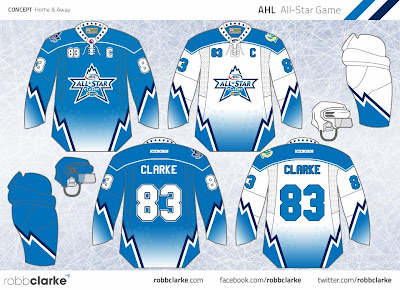
AHL vs. Färjestad BK
Submitted by: Robb Clarke

Oh my goodness I'm in love with this concept, I want to suggest it to my good colleague Dave Andrews! Yes, remember him, the one whose class I took - who is the CEO and President of the AHL? Yes him. Almost everything makes sense. Not knowing which jerseys  will be worn by the visitors, having a back-up jersey is always a good idea. I like gradient not because it is semi-pro hockey, but because it is an special event match not a season competition. The only thing I'd like to know is why solid numbers sans outline are featured on the white uniform. But Robb pretty much nailed this one.

Colorado Avalanche
Submitted by: K14 Koncepts
I really like this set from K14 as well, but it's too eerily similar to a pair of familiar jersey sets: St. Louis and Anaheim - both of the 90s. There isn't enough distinction in the striping despite an additional stripe and the hem color not being extended on the sleeves. To make the striping look original, turn it int a jagged set of lines to create a mountainous looking terrain like the old jerseys, but with the same angles used here instead. The silver help create a fake metallic feel to it as well, and is what it should be doing as an accent color.

Retro-modern: Burger King
Submitted by: Ricky (Me)
With this one, I wanted to be both original and authentic at the same time. I took what I liked from the original Burger King jersey and added others not from it. of course, I am also making sure the jerseys actually have a different color from what they originally were. I would really like to see the purple come back as well as the crest logo I used.

Well, it's going to be a busy rest of the day and I am going to finish preparing for it. And with the upcoming events, it will be very interesting for sure. Enjoy your weekend!

-Ricky

17 January 2014

They Say it's My Birthday

Rumor has it the above is true, so I just go along with the title. But today is not about me. No matter I was just called in for the team I am liaison-ing tonight for a last minute practice. So again apologies for the briefness in all of this.


My concern here is that there are two preferred shades of green. A lot of people don't like the double blue together. I do appreciate the throw back alternate, but the direction the team moved in with the current set would be just fine. There's more white in the uniform and the darkness of this green shad highlights the cres much better.

All in all, I'll let you know how we did on Sunday. Go Royals!

-Ricky

16 January 2014

Hoophall Ahoy

As this year Spalding Hoophall Classic has begun, I am getting ready for my first shift tomorrow Where I'll be with the women's basketball team from Christ the King High School of New York City. My co-liaison has been so exited for this particular shift just because I was pitted with her. Nobody has ever been so excited to work with me for anything (not that I don't get along with folks or anything). But we are well on our way. I will not need to be in for that game until 6PM so I will have all day to chillax.


Here I wanted to bring back the Burger King jersey and make it purple as the color to use for coloring the old (for now) third jerseys. And I would like to see more purple again and have it brought back. I wasn't fond of the font so I left it at what the have been using. Other than that, the gradients have been duplicated accordingly.

I would write something else, but I may be needed to be on call in-case something happens with someone else. That will be the case all weekend. So we'll see how things work out. I'll be back!

-Ricky

15 January 2014

The Other Plymouth Isn't Far from Hartford

Today, Alan provides us with a Plymouth Whalers concept. They play in the Plymouth Township in Michigan as a member of the OHL in the CHL. The other Plymouth close to the home of the former team in Hartford, CT is in Massachusetts. As the (at least) American readers know it was the first landing spot of the Pilgrims on their voyage to North America on the Mayflower.


My only real issues are the hem and cuffs. I know they resemble the Whalers cuffs from their most recent uniform (before they moved to Carolina) but I'd like to see green be more prevalent again but not like it originally was. Swap the green and silver and I'll be just fine.

The Spalding Hoophall Classic will be in full swing starting tomorrow, but we begin tonight with the last minute preparations. Until then, I'll be back.

14 January 2014

Istanbul, not Constantinople

Today, I regret that I must be brief. Jake88 has an IIHF concept on display and you can see that below. It will be like this at the blog for a little while, but don't get completely used to it (lest I say otherwise).


I don't know what the current jerseys look like (the new ones anyway). I'm afraid this seems too simple for this template. It also makes it look more crowded on the colored uniform. As for the striping, feature the crescent and star on a single, solid stripe at the current position of the striping of both jerseys. Therefore, remove the flag from the home kit and replace it with the road crest font. There you have it.

No time to chat today. Enjoy another terrific Tuesday!

-Ricky

13 January 2014

The Blitzer Gunners

Hi friends, today I'll be slightly following up from a previous idea. There is a place in the city of Buffalo on Hertel avenue called Mes Que. The official tailgating site for two soccer teams in particular. The National Premier Soccer League's FC Buffalo are adoringly nicknamed "The Blitzers" and Arsenal of the Barclays Premier League "the Gunners (colloquially). Ad you may recall the Buffalo Arsenal club wanted an alternate logo, for which I came up with several solutions. I recently had an epiphany to being Buffalo without copying the rest or something to that effect. My eureka moment came up with a flag.


Yes, it's the flag of the city of Buffalo, NY and it's "Arsenalized." I took several Arsenal elements and incorporated them to replace the city seal in the center to look like the current crest while including the 70s cannonballs and the clubs establishment as well as (of course) replacing Buffalo blue with Arsenal red. That was my idea. Now i have to present it to the group in a couple hours at the viewing party when Arsenal play at Aston Villa. For now, that's all I've got. I will get back to you very soon!

-Ricky

12 January 2014

Sound the Alarm!

Greeting to to regulars and a warm welcome to any new readers visiting today. Given my schedule over the next couple of weeks, there will be one concept per post. Those will all be between Alan, Jake, and myself. I apologize for the lack of my work as this will somewhat delay my retro-modern series.


 I've reviewed this at HJC the day after the Blackhawks won Lord Stanley's Cup in 2013. I will quote it verbatim:
This logo does not look like a bear as it's supposed to and it's hideous, but Alan had to make do with what he had. but for the jerseys themselves, not bad at all. What catch my attention are the striping pattern on the sleeves, hem, and yoke. That's what really make the concept with a nice addition of NY Rangers style pants. The only thing is that the black stripe closer to the body of the jersey needs to be a little thicker for my taste, enough so that it evens out the red and gold stripes. 
I stand by everything I said and left out the concept rating from that post. After that drawing class I took in the summer, I discovered other ways to look at objets d'art from several perspectives, which I've now done to unmask things like symmetry (etc . . .). But I do realize what you think one day may change on another day. This is not one of those times.

Well, tomorrow it's Jake88 to step up to the plate and my next concept will be on deck. That will be the next of my series. I await it's unveiling, but not before the excitement from Jake88 of course. See you on the flip side.

-Ricky

11 January 2014

HCI: Post VII

*** The following is my post from a different site, please visit hockeyconceptideas.blogspot.com for the article. ***

Friday: The Hockey Rangers are Very Prevalent

We have two concepts today and by the way I got another new hockey jersey (and a baseball one)! I'm even bidding on a third one. While you'll get to see them, first thing's first. We have two concepts one is new and one is not. One is by an HCI writer and one is not. One has an alternate and one does not. One has some red and one does not. See a pattern here? I am beating around the bush a little too much, but all in good fun. Let's get to both right . . . NOW!

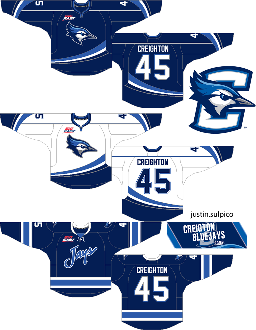
Creighton Bluejays
Submitted by: Justin Sulpico

As you may recall, our Sunday writer Justin Sulpico submitted this into our Creighton Bluejays competition a few weeks ago. While I don't like that he has brought back the old wordmark, Everything else is spot on His came in third place, but had I voted (like I thought I did) this would've been my selection. I'm not sold on the number font, but it makes sense and could be a lot worse than other fonts.

Submitted by: Matt McElroy

This Rangers Shield logo is a step backwards for the Rangers, who I'm guessing won't change still for at least another 10 years with the way technology is going. The red pants and its striping will be around, I'm sure. But wait, what is this?! The classic yoke striping is gone from the road white! Due to the classic yoke, I would get rid of what has been put in place and put the classic yoke back.


Though you've seen the Buffalo Sabres one already, I didn't have my camera handy as it was left in my dad's vehicle. Speaking of the Sabres (eh?), their front office layout has changed with the hiring of Tim Murray formerly of the Ottawa Senators as general manager (among other hires). Note the Christmas decor is still up from Orthodox Christmas in this picture (though there really isn't anything commercialized about it). The latter two came in yesterday so I was really excited - it made me forget about other bad news (home stuff) for a while, that is until I had to go back to it. I'm still working on the "acid trip" bidding (now at US $61 when last I checked yesterday night). Even though the Halos are a baseball team, I included it anyway.

All in all, we had a solid day at the office. It's a matter of time until teh HCIHL's Skopje Foxes continue to climb up in the standings. After an emphatic win last week, they are continuing on that good momentum to start this week. They could be in a heat for second place at the end of the game week. But no matter, off to create more concepts I go.

-Ricky

10 January 2014

The Trans-American Jersey Delivery

I am two jerseys richer and not all smiles today, but this helped take my mind off the other issues for a brief moment anyway. I am also going to see these Thieves in Banditland again tonight as I hope Troy Cordingley gets to stick it to his former coaching employer Toronto. I don't believe he should've been fired, but then we may or may not have picked him up. But that's not what were here for right now!


Both of these got here yesterday (a day later than expected) as anticipated due to the snowstorm that I knew wasn't really a blizzard though a blizzard warning was issued. I wore the Strangers jersey a bit and quite honestly it felt good, and I was worried because I have never worn a jersey of a team that I don't support before much less one of a team I don't like. It goes to show that I really am one for the jersey. I do wan't to have that one customized (if it were a player, only Mike Richter - though Rick DiPietro would be funny). But for now, I'm content with a blank one.


The Halos one meanwhile, I think we all know what's coming. Eventually, I will invest in a Tim Salmon, Nolan Ryan, and Gene Autry edition over time, but those for now will wait too. A David Eckstein would be nice, he didn't want to leave Anaheim when we didn't want to renew his contract. They wound up granting him free agency (DEC '04) to sign absolutely nobody big (all of '05), draft and sign Peter Bourjos who we just recently traded for David Freese, draft and not sign Buster Posey in the 50th round, and have the Royals claim Joel Peralta off of waivers. Eckstein was hard to keep off the base pads as the lead-off man with a high OPS and good Walks to strike-outs ratio. He even had back to back walk-off grand slams in consecutive games against the Blue Jays on May 28 and 29 of 2002 at home.

As I am mentally preparing fro the next couple weeks ahead, I am may seem out of touch. Don't worry about it, it's one of t he most hectic times of the year as I am doing some extensive travelling as far as other than my return to Massachusetts. I'll be back Sunday, but I'm up at HCI in a half hour. That will wrap up today - enjoy your weekend!

-Ricky

09 January 2014

Lady Liberty and the Pioneers

Sounds like a good band name for someone. Here's how this is going to work. So that I can adequately space out my concepts in timing with going back to Springfield next week, I am going to utilize recently submitted concepts by Jake88. New readers who aren't familiar with his work, check out his other stuff in his portfolio on the "conrtib's" tab or you can find stuff on his blog, though it's been a while since posting.


I will tell you that I was not a fan of some of the specs of  this HJC contest and that I don't like submitting my artwork to be yielded to the inquiring entity (so I don't enter). I would at least require a small royalty fee, just for each time the hire me to do the design portion. After I've made it I don't care what happens to it as long as it isn't distorted without permission and seeing as I've been compensated for my labor. While I don't mind the originality piece, I didn't like any of the logos or wordmark that people came up with.
Jake88 really had the best entry. That's because of the two alternates. However, I would make the grey uniform red and conversely the red to grey. I like the other jerseys as well. Everything in these designs are perfect except the primary/crest logo and the striping on the red alternate. With the striping, keep it but change the hem and cuffs to red or switch the white and blue in the striping then keep the cuffs and hem navy.

While I regret not sharing a concept of mine with you, I have at least one that was finished yesterday morning and that one is the one I will present Sunday with another concept from today's contributor to boot. My two jerseys should be in today and will both appear briefly tomorrow with a little bit more on Monday. Sally forth and a good day to you all!

-Ricky

08 January 2014

Quack City Trick, Quack-Quack City Trick

Hello to everyone all across the fruited plain (and the rest of the world)! Now the followers from the eraly days know that I've experimented with the Ducks as a means of different types of uniforms. Be it Hawai'ian or Zubaz and everything in between, I have pretty much been there. This however is a more traditional approach - a popular concept design using Wild Wing, but all I did was transfer the original to a Reebok Edge template and switched colors. The color switching is common, and the template sort of is, but if you take away the template it would generally look identical to the original outside of the color.


I'm not completely sure which one will be featured next but because of yesterday's weather, I'm not sure if if Lady Liberty will be arriving late. That may not be good because I head back to Springfield in a week already! Then again, I'm a week ahead of the non-winter athlete/non-resident assistant body of campus that has to be back early. At least I can keep getting done the things I wasn't sure I'd get to do. Speaking of which, I'm going to continue that right now. I'll be back soon!

-Ricky

07 January 2014

What the Canuck?!

Merry Christmas to our Orthodox followers celebrating today! The Macedonian community in Western New York will not be able to attend the religious service due to the driving ban placed as a result of the blizzard advisory for today. We're supposed to dip into the negatives for the second time in a week for the first rough winter since 2001 (it hasn't even been that bad until about a week ago, but the worst is coming in weekly{?} segments). We've been going third jersey crazy lately here and it is going to show even more with the concept for today's post. I decided that since I'm not going to consider getting one of the inaugural Canucks alternates at this time, I will reminisce by creating my own. The first hockey concept and second overall on the year is sure to spark some conversation. Note that the striping is going to look a little jagged for some reason, but don't let it bother you too much.


While much of the original design has been implemented, the current color scheme as well as modern branding (logos/font for the most part) are brought in. To tie in the two nicely, I figured that Pavel Bure's retirement ceremony was the best way to combine the eras - two months too late . . . Anyway, you've heard of retro-modern baseball parks, right? Maybe? Possibly? Well those style stadiums are ballparks built to modern standards while still maintaining an old-fashioned atmosphere. Cleveland's Progressive Field started this trend in the 90s and teams have continued to do so since - not to be confused with retro-classic ballparks. Though Coca-Cola Field here in Buffalo is the first retro-classic ballpark in baseball, Baltimore's Oriole Park at Camden Yards is the first in the majors. Wikipedia can break this down further if you have interest on the topic. That's one thing baseball has over the other sports is that no two playing surfaces are alike, thus the surrounding structure takes at least some form of the field. But this concept is certainly everything I've describe as it relates to the hockey jersey and it's franchise.

That would be a cool thing to do, now that I think of it - start considering doing a retro-modern third jersey series. SG-94 prominent HJC contributor has done a Reebok "de-Edge" series, which you would identify as retro-classic (because of the template). Don't be surprised if that happens, I sure would like to see it. For now, that will have to do. In anticipation of the Lady Liberty jersey starting tomorrow, I don't know what will be posted but there will be something. It will just be shuffled around based on it's arrival.

-Ricky

06 January 2014

Fry Up the Eagles

Lately, I've been working on the Nike Revo (American) football jersey template. I don't like it because, it is too restrictive (more than one would think anyway). In the mean time, I forgot to mention yesterday that I found an "Acid Trip" Coyotes jersey up for bids on Ebay. I started on it as the second bidder at US$2.50. Then first person in the war responded a few times and I am now going to wait until the very end and stealth it so that I don't bid up on myself. Right now, the other bidder is at US$25-ish from what I remember give or take a dollar. But it is indeed another blank jersey.

Outside of that my Lady Liberty jersey should be here between Wednesday and Friday. Expect it to be on here by Sunday (if arriving on Friday). Good thing is that I'll get a little love form the decent-sized Ranger crowd when I'm back in Springfield. But back to the Revo template, I have one concept ready. As one parody goes: "fry up the Eagles, with Philly cheese; fry up the Eagles 'cause we hate the NFC," and the next verse "fry up the Eagles, fricassee; fry up the Eagles, then we'll toast the referee." For the correct order of everything, I put the YouTube video up below (I own the discs with all of these Bills parodies). This certainly is better for some rival fans than the original Fly Like an Eagle by the Steve Miller Band. That was parodied by the local 96.9 rock station in Buffalo during the Bills Super Bowl runs just prior to being their flagship radio station (which affiliation ran up to the end of the 2011-12 season).


Now I don't know how the on-field jerseys actually look, but I feel that even those are lightweight (nothing stitched on). One big thing that I don't like, stitching or not, is the lack of number outlines - though I am trying to follow what appears to be accurate to this template. There are matching helmet template, but i haven't found a good one yet. Anyway, I do know that some form of the team logo is placed just below the collar and the NFL shield is in the middle of the collar bottom. I also know the numbers in many cases are even more over-sized than my rendition above. The shoulders have some flexibility in them with that the sleeves can be use either for the striping and/or logo with the numbers above it on the shoulders or it can be replaced by numbers without either of the former with the shoulders then being blank. Those are the main things, but still. Now-a-days NFL jerseys with me have lost their splendor. The fun jerseys are gone and most if not all seem bland (most of the league) or overdone (Seattle). This again is all about the template in the eyes of Reebok. Nike then took over and came out with their own thing, but are not quite as unique as Reebok - though I'm not particularly fond of either firm. That's enough football for me for ever, but I'm sure I will come back to it again - in discussion anyway. It's difficult for me to design, but the effort is there anyway. Until next time.


-Ricky

05 January 2014

New Jerseys are Afoot

I've won that Lady Liberty jersey! Well, not the one I originally bid on, but one that got listed around the time Friday's post went up and I saw after publication. By that point the other one I bid the other guy up to US$91 and double-checked for newly listed items which I found the one I won. It was slightly cheaper and I bought it even though I could bid on it and wait two days (I wanted the satisfaction of not getting outbid and more-so not waiting).

In the mean time, another jersey was listed before either of those. I found an original Lightning alternate jersey which I initially bet on and got outbid. From there I gave up, found the Lady Liberty ones and saw that when I got outbid was the last placed bid. I had decided to bid on it again but did not and wound up losing the bidding war to a late entrant who wasn't previously bidding (the new guy doubled to over $100 and won  it). This jersey happens to be in need of a slight face lift as the crest logo is slightly removed from the jersey. I don't think it is stitched on, but it isn't a cheap application (historically accurate crest material?) either. I could have even taken it to my buddies at Al-Ross Sports Screening, whose relative graduated with me from school. Not sure about Al, but Ross Cellino is the uncle of my classmate and the Cellino of the Buffalo-owned Cellino and Barnes law firm. He was for a time an employee for the locally-famous Cellino family plumbing business when his law licence was suspended in the mid 2000s. Never met him, just members my classmate's immediate family (mom and dad).

(Look at the bottom of the bolt)

Let's go back to that Rangers jersey for a sec. I want to have it customized but am not sure to what yet. If anyone that actually played - Mike Richter. He even got to wear the design on occasion. I thought about the name September and number 11 on the back with their memorial ribbon patch on the right side of the front. But i'm sure the patch is extremely hard to find and 9/11 has no real significance to me other than I love my country and it's a touchy subject in general. I would then need to get one of the Bruins alternates (the current ones or else "Winnie the Pooh") and put B. Strong for the name and the number as 3 if I had the Rangers one embroidered as mentioned above. I use 4 instead of 617 because the area code represents only the members of just that whereas the three represent the death toll which represent both local and international communities Bostonian and Chinese). 1 for One Fund Boston and 20 for the 4 deceased and 16 known new victims who lost limbs either on site or were amputated on are other alternatives. If you have suggestions, you're welcome to leave them in the comments below.

May I also add that the Buffalo Sabres have been playing both rather well at home and in the second period as of late, things they had struggled to do all season. They now have six consecutive wins at home. And the Niagara-on-the-Lake native Zenon Konopka looked good in his first game in blue and gold from waivers by Minnesota. In addition, Matt D'Agostini has his first goal of the season and as a Sabre. Elsewhere, I went to our lakefront property today. After having gone last week, I realized it was my first visit since the upstairs restroom was completed. If my mother has them, I will try to provide them.


Nothing special, but definitely better than it was. My mom was the "designer" and we had hired an Amish furnisher to help with specifically the woodwork. It turned out better than I figured so it all worked out. Speaking out out, it's time for me to peace out. Until next time!

-Ricky
Creative Commons License
This work is licensed under a Creative Commons Attribution-NonCommercial-NoDerivs 3.0 Unported License.