
30 September 2013

29 September 2013
Egg-stinct Eggplant
Remember I said I was anticipating the arrival of a new birthday/Decmber 25 gift? well it turns out it was the one for the last such date (2012/13). How is that you ask? Well find out for yourself!


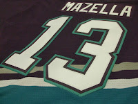


I thought about Kariya, Selanne, or Giguere but opted out on it. Glad I can add it to my arsenal of uniforms nonetheless!
-Ricky


I thought about Kariya, Selanne, or Giguere but opted out on it. Glad I can add it to my arsenal of uniforms nonetheless!
-Ricky
28 September 2013
HJC: Post XIX
*** The following is my post from a different site, please visit www.hockeyjerseyconcepts.com for the article. ***
Friday: It's Time
It may be Friday, but it's my last post of the pre-season with opening night on Tuesday. The Ducks are opening on the road in Colorado who lost their most recent pre-season game last night and Buffalo is at new division opponent Detroit's Joe Louis Arena. In other news, I think Commissioner Andrews sees something in me because he gave me the first copy (fresh off the shelves) of the 2013-14 AHL Media Guide at the start of class on Wednesday night. Also, our class had made the Springfield Republican newspaper on Tuesday (as we had a photographer in class the week before). If you ever get to meet Dave Andrews, he's pretty cool. And now the important designer stuff! Reminders, as usual, are included below
Tampa Bay Lightning (Justin F.)

Let me start this one off by saying I like where this is going - a lot. The striping alignment is fantastic. I could do without the yoke and outline however, as well as at least a single (if not double) outline on the numbers. If a double outline is to be used, consider matching the striping. I'd like to see a black uniform in TSP again. One thing I will point out about the hem strip is that it should probably be raised a little bit and the to remove the stitching below it. An 8 out of 10.
Ottawa Senators (Nikesh B.)

I'm not big on the two stripe thing, but it definitely makes sense for the franchise. Everything appears to be alright, assuming this was created in MS Paint. But I think I would like to see this become a set with a white as well as a black one to see if we can use either colored uniform as an alternate. Even if it isn't in the striping as has been the case before, I would like to see the return of the reeds as is on the 00/01-06/07 alternate. A 7 out of 10.
Anaheim Ducks (Alan H.)

I've always loved this template, but it hasn't really had that perfect "match made in heaven" to be used for. This isn't one of those, although not bad at all. When we had that competition recently, it reminded me how thankful I am that my boys aren't wearing those colors. Unfortunately, the logo stayed - beggars can;t be choosers I guess. I like the distribution of the colors but you can never get the combo for the logo right, I tried this with the logo after the comp was over and that didn't work well at all. The striping pattern is a go with me but the name and number outline should switch the orange and black around. A 7.5 out of 10.
Rockford IceHogs (Kyle N.)
.png)
Definitely out of the box work from Kyle here. I appreciate the effort - especially for a non-NHL team, but I'm not a fan of the striping on the home white in this concept. If it matches the road black (with the accommodating adjustments), I'll be happy with that. Also, I would remove the extended black cuffs from the alternate. The alternate should probably go white in numbers as red on red just doesn't fly with me. A 6.5 out of 10.
Anaheim Ducks (Dylan W.)

Okay, this is significantly different from a typical Ducks concept. This might be more wild than the original Wild Wing jersey. I like the use of the eggplant and jade up until we get to the arm and hem striping. While the striping itself is great, the excess white kills the mood of the jersey, while it would be better if said excess is eggplant and help significantly even though not the best solution. I wouldn't be chill with a lack of striping but nothing exciting. Simple would be the way to go with that. A 7.5 out of 10.
Sault Ste. Marie Greyhounds (Scott D.)
.png)
"Soo" needs to get a new logo in order for me to take their uniforms seriously because I can't do the bi-color thing (except for the Red Wings who have been pulling it off for years). The gray won't do, but it would be a step in the right direction nonetheless. I would try to be more entertaining with the home and road striping for starters. Then after that I don't know if there is anything else anyone can do. Maybe Darnell Nurse can operate, a 6 out of 10.
Univ. of Miami (Mike S.)
.png)
As Mike moves right along with the Atlantic Coast Conference, a storm front is passing through Miami. This one is really the eye of the hurricane - virtually perfect balance in this concept. Orange numbers with white would go better to match the logo but what I like most here is the yoke. Not quite like the Bruins not because it has two colors, but that it doesn't extend to the outline. The pant striping I'm alright with despite the mismatch as it is appropriate to Miami's history with said pattern. The storm warning reads an 8.5 out of 10.
Calgary Flames (Trevor M.)

There is a lot to this one. numbers are over-sized and the lack of TV numbers is also evident. I don't know that an outline is necessary for the NOB. I'd try to stick with solid colored collars. Those collar inserts probably stay the color of the jersey. I would like to see matching striping patterns on the home and road - preferably the one from the latter. It wouldn't be a bad idea to fix the top stripe of the hem on the back of the alternate, which by the way has a great crest that could use slightly larger numbers. I wen't down to the ring of fire and the Flames can get higher at a 5.5 out of 10.
Adirondack Frostbite (Jake88)

Dave Andrews just mentioned in class about how Sen. Chuck Schumer (D-NY) is trying to convince the temporary Adirondack Phantoms to stay in Glens Falls. Based on the old United Hockey League team, Jake 88 relocates the Lake Erie Monsters (currently situated at the Q in Cleveland). This might be a better alternative. The colors are surprisingly good for this concept. I wonder if this is a. Once again, I am surprised not to see the gloves colored in. I'm still not completely sure why, but I'm a stripes on the pants kind of guy so something has to be there for me. Turn up the thermostat to an 8.5 out of 10.
The Commissioner tells us that we have an in-class assignment at a Hartford Wolfpack game next month. That will be . . . interesting. In the mean time I would like to go to an NHL game at the TD Garden whilst i'm in the are, but that may have to wait. In any event, enjoy your weekends!
-Ricky
Friday: It's Time
It may be Friday, but it's my last post of the pre-season with opening night on Tuesday. The Ducks are opening on the road in Colorado who lost their most recent pre-season game last night and Buffalo is at new division opponent Detroit's Joe Louis Arena. In other news, I think Commissioner Andrews sees something in me because he gave me the first copy (fresh off the shelves) of the 2013-14 AHL Media Guide at the start of class on Wednesday night. Also, our class had made the Springfield Republican newspaper on Tuesday (as we had a photographer in class the week before). If you ever get to meet Dave Andrews, he's pretty cool. And now the important designer stuff! Reminders, as usual, are included below
--------------------------------------
We are looking for a new writer on SATURDAY. Please click the banner above for details!
If you've applied before, feel free to submit again.
--------------------------------------
USSR Comp To 5 vote (ends tonight @ 11:59pm Eastern)
COTW Sept 16-22 vote (ends tonight @ 11:59pm Eastern)
--------------------------------------
Tampa Bay Lightning (Justin F.)

Let me start this one off by saying I like where this is going - a lot. The striping alignment is fantastic. I could do without the yoke and outline however, as well as at least a single (if not double) outline on the numbers. If a double outline is to be used, consider matching the striping. I'd like to see a black uniform in TSP again. One thing I will point out about the hem strip is that it should probably be raised a little bit and the to remove the stitching below it. An 8 out of 10.
Ottawa Senators (Nikesh B.)

I'm not big on the two stripe thing, but it definitely makes sense for the franchise. Everything appears to be alright, assuming this was created in MS Paint. But I think I would like to see this become a set with a white as well as a black one to see if we can use either colored uniform as an alternate. Even if it isn't in the striping as has been the case before, I would like to see the return of the reeds as is on the 00/01-06/07 alternate. A 7 out of 10.
Anaheim Ducks (Alan H.)

I've always loved this template, but it hasn't really had that perfect "match made in heaven" to be used for. This isn't one of those, although not bad at all. When we had that competition recently, it reminded me how thankful I am that my boys aren't wearing those colors. Unfortunately, the logo stayed - beggars can;t be choosers I guess. I like the distribution of the colors but you can never get the combo for the logo right, I tried this with the logo after the comp was over and that didn't work well at all. The striping pattern is a go with me but the name and number outline should switch the orange and black around. A 7.5 out of 10.
Rockford IceHogs (Kyle N.)
.png)
Definitely out of the box work from Kyle here. I appreciate the effort - especially for a non-NHL team, but I'm not a fan of the striping on the home white in this concept. If it matches the road black (with the accommodating adjustments), I'll be happy with that. Also, I would remove the extended black cuffs from the alternate. The alternate should probably go white in numbers as red on red just doesn't fly with me. A 6.5 out of 10.
Anaheim Ducks (Dylan W.)

Okay, this is significantly different from a typical Ducks concept. This might be more wild than the original Wild Wing jersey. I like the use of the eggplant and jade up until we get to the arm and hem striping. While the striping itself is great, the excess white kills the mood of the jersey, while it would be better if said excess is eggplant and help significantly even though not the best solution. I wouldn't be chill with a lack of striping but nothing exciting. Simple would be the way to go with that. A 7.5 out of 10.
Sault Ste. Marie Greyhounds (Scott D.)
.png)
"Soo" needs to get a new logo in order for me to take their uniforms seriously because I can't do the bi-color thing (except for the Red Wings who have been pulling it off for years). The gray won't do, but it would be a step in the right direction nonetheless. I would try to be more entertaining with the home and road striping for starters. Then after that I don't know if there is anything else anyone can do. Maybe Darnell Nurse can operate, a 6 out of 10.
Univ. of Miami (Mike S.)
.png)
As Mike moves right along with the Atlantic Coast Conference, a storm front is passing through Miami. This one is really the eye of the hurricane - virtually perfect balance in this concept. Orange numbers with white would go better to match the logo but what I like most here is the yoke. Not quite like the Bruins not because it has two colors, but that it doesn't extend to the outline. The pant striping I'm alright with despite the mismatch as it is appropriate to Miami's history with said pattern. The storm warning reads an 8.5 out of 10.
Calgary Flames (Trevor M.)

There is a lot to this one. numbers are over-sized and the lack of TV numbers is also evident. I don't know that an outline is necessary for the NOB. I'd try to stick with solid colored collars. Those collar inserts probably stay the color of the jersey. I would like to see matching striping patterns on the home and road - preferably the one from the latter. It wouldn't be a bad idea to fix the top stripe of the hem on the back of the alternate, which by the way has a great crest that could use slightly larger numbers. I wen't down to the ring of fire and the Flames can get higher at a 5.5 out of 10.
Adirondack Frostbite (Jake88)

Dave Andrews just mentioned in class about how Sen. Chuck Schumer (D-NY) is trying to convince the temporary Adirondack Phantoms to stay in Glens Falls. Based on the old United Hockey League team, Jake 88 relocates the Lake Erie Monsters (currently situated at the Q in Cleveland). This might be a better alternative. The colors are surprisingly good for this concept. I wonder if this is a. Once again, I am surprised not to see the gloves colored in. I'm still not completely sure why, but I'm a stripes on the pants kind of guy so something has to be there for me. Turn up the thermostat to an 8.5 out of 10.
The Commissioner tells us that we have an in-class assignment at a Hartford Wolfpack game next month. That will be . . . interesting. In the mean time I would like to go to an NHL game at the TD Garden whilst i'm in the are, but that may have to wait. In any event, enjoy your weekends!
-Ricky
27 September 2013
Melbourne to the Meadowlands and Back
I wanted to use some of the AFL jumper designs in a different capacity, the first from the Melbourne Demons. It's from their 2010 clash jumper.

Just playing around with it, nothing special.
-Ricky

Just playing around with it, nothing special.
-Ricky
26 September 2013
Jake88 Strikes Again!
This one is cool, Jake created his own logo for this Finnish international team in a sport called "Yakball".
From what I've read, I don't know that I like the sport. Having created one myself a few years back and going through the copyright process someday, I do not think that It will catch on as well as mine because of my insider secret - my game has no time limit and unlimited scoring which is fast paced and high scoring (what America is looking for; my personal best is 208). My score is much more oriented towards tennis and racquetball and is a racket sport. I won't be talking too much about it until I have it copyrighted. Kudos to the guy who invented it though.


The Penn State ones look just a little bland; but for someone who learned about a new sport, I would say this is pretty good (all of it).
-Ricky
25 September 2013
MLS Nationalities
Found this interesting . . .
 |
| Image Courtesy of: Official MLS Facebook Page |
More diverse than I thought.
-Ricky
24 September 2013
Don't Reign on My Parade
Jake88 has sent us in some ideas.

I like where this is going, Thrashers alternate template in hand. Gradient works (after all, this isn't the NHL) and it's very subtle anyway. Perfect balance of color, practically matching. The striping is weird, but then again, the alternate crest looks more like a bat from a distance.
In the mean time, yesterday was our semi-semesterly flag sale where our flag guy Des Anderson provides near wholesale prices. I know that because A) he told me, B) There's a place near my old high school that is almost double in price compared to his company, and C) I almost always get something from him even if it isn't a flag. My collection will appear soon. In the words of New Era Caps, "fly your own flag!"
-Ricky
23 September 2013
Wunulala Dreaming
As if the title wasn't indigenous enough to name a Qantas plane . . . oh wait, it is a named plane. Speaking of indigenous, I created an indigenous round jumper for North to be used in the 2014 season (round 9 again?). I wanted to make it look authentic and I think I've succeeded at that.

Let me tell you, this one was really fun to do! The guys at the Big Footy Forum have given really good feedback so far. I even stumbled upon doing footy graphics - I'll show my first one of those on Wednesday after I showcase a piece from Jake88. I'd love to do this for every team when I get a chance . . .
-Ricky
22 September 2013
Indiana's Game, Indiana's Team
I wanted to put together a hardcourt design and wasn't sure what wood to use or rather how to distribute it. It came out a lot better than i had anticipated. As much as I like what the Bankers Life Fieldhouse has set up, I gave it anew anyway.


I'm generally more in favor of darker wood, so I try to make it work when applicable. I think that the large quantity of gold is made logical by the large amount of dark hardwood used. Combined with the other hardwood, it creates a balanced appearance. Give these a gander and tell us what you think!
-Ricky
21 September 2013
HJC: Post XVIII
*** The following is my post from a different site, please visit www.hockeyjerseyconcepts.com for the article. ***
Friday: Predominantly Primary Palette
As I hinted at last week, there may have been a Sabres alternate template in the works. Low and behold, it was indeed released on Monday. I can't believe we're really that much closer to hockey already, I'm really excited! On top of that, do those Stars jerseys pop or what?! As I always say, the jerseys look better on the ice than when they're drawn up - most of the time. No matter, there's a lot of bouncing around to do, so let's get to it.
Just 3 CCCP entries for today, as found below:
Alan

Mike S.

Tom18

Stadium Series - LA (Justin S.)
.jpg)
I have nothing to say about the Kings jersey as it is fairly realistic to a retro jersey (I never liked this stylized crown, but that doesn't matter). My Ducks, however catch my attention much more. This appears to me to be a white version of those black alternates the read "Mighty Ducks of Anaheim" on the front. Now as much as I like those and good execution here, The crest logo needs to go and be replaced with either said crest or the Wild Wing logo. A cool day in LA, 7 out of 10.
St. John's Ice Caps (Kyle)
.png)
The Mile One Centre has a significant meaning in my life as both my team and league office are based there in my fictional roller hockey league. And speaking of significance, they will host this season's AHL all star Game (I found out before the announcement - a perk of being in class with Dave Andrews). Okay, these are very resemblant of Winnipeg but still slightly pulling away from that identity. I like the addition of the new hem stripe, a rare occasion that I'm okay. The alternate on the other hand, I can't say the same I'm alright with the 'Canes new yoke and the lighter blue, but that's all. We hit the iceberg but are not gonna sink, 7.5 out of 10.
Wheeling Nailers (Mike S.)
.png)
Well this logo is much better than the original. I'm not fully on board, but I'll favor it mightily over the goalie mask and rail spikes. And the striping! The tan on the lower sleeves and lower hem makes it stand out much more than if it were just white. I'd like to see some stripes on the pants, but it's alright. This is one of the better ones in the series, but it's the last one I get to review in the ECHL series Mike's done a fantastic job preparing. If you won't be around tomorrow, be sure to congratulate Mike on his completion of this very lengthy series! An 8.5 out of 10.
Colorado Avalanche (Jack)

Powder over royal or navy . . . I can see this. I don't like it as much but I far from hate it. However, I would just keep the word-mark on the road white. Are the TV numbers looking small or is it just me. This one is very difficult to find much to talk about. Timberrrrr - a 7 out of 10.
Boston Bruins (Matt R.)

This look I think would be better suitable for the Hershey Bears than the Bruins The striping (except maybe on the pants) and hem in particular are gorgeous as is the alternate logo. The "Grimace bear" I could live without, but I suppose it could've turned out much worse. The numbers on the road white aren't bad, but a dark number and double outline could also work. The Bruins are almost out of hibernation and recharged, an 8 out of 10.
Canada (Kyle)

This is quite peculiar. I like it and I don't at the same time (better than not having any opinion I suppose). Mesh uniform is good, chest presentation alright, numbers a teeny bit large, colored lower hem is just bizarre, socks - not my cup of tea, I'm afraid. Seeing that the shoulder patch logo is just that, I'm fine but I never will be a fan of it. Back to the socks, problem is that they can't be altered to accommodate the jersey based on its design. This might be one time where matching striping doesn't apply with me. The Canadian flag will fly at half mast today to commemorate their jerseys of the past , a 6.5 out of 10.
Canada (Adam)

Asymmetry - can you say Atlanta Thrashers? Doesn't work for me here. This whole thing just seems like a step backwards for them. TV numbers seem small as well in this one. The yoke on the white, well . . . I only half-like it. That is, the back half looks great but not the front half. I think if we removed "Canada" from it's current position and place it elsewhere it could be a viable inclusion to the concept. All in all, a 6 out of 10.
Toronto Maple Leafs (Matt R.)

Double blue for the Leafs, another on the fence decision from me. First, ditch the outline on the logo and numbers. The striping is alright, but it looks a little better on the road white than on the colored uniform. If they could utilize a similar scheme to that of the Argo down the way at the Rogers Centre, I think the leafs could pull it off, but I also feel that it would offend a lot of the fans. No riots at the "Church on Carlton" yet, but a 7 out of 10.
Chicago Blackhawks (Jack)

Well, changing a more recognizable logo isn't doing this submission a favor. Going black instead of red for a sweater isn't bad though. Howabout this semi-radical idea. Red numbers for both with a double outline jersey color on the inside then the white or black (respectively) on the outside. Striping is fabulous with the exception of the extension on the sacks and lack of on the pants. A 7.5 out of 10.
Springfield Falcons (Kyle)
.png)
This takes the cake to start the weekend. Drop the word-mark from the crest logo on the red and match the striping on the hem to that of the sleeves on the alternate. Also, please figure out a way to make the TV numbers stand out better. I wish they'd use their red alternate as a primary and demote the navy to alternate and create a home white of the red. But for the sake of this concept, it suits me almost just fine. An 8 out of 10.
Next week is my last pre-season post, so keep your eyes peeled for who gets the hardware and the pre-season poll in the comments section. You'll of course be more than welcome to do so.
-Ricky
Friday: Predominantly Primary Palette
As I hinted at last week, there may have been a Sabres alternate template in the works. Low and behold, it was indeed released on Monday. I can't believe we're really that much closer to hockey already, I'm really excited! On top of that, do those Stars jerseys pop or what?! As I always say, the jerseys look better on the ice than when they're drawn up - most of the time. No matter, there's a lot of bouncing around to do, so let's get to it.
------------------------------------
Only two reminders today, follow them promptly if applicable.
COTW Sept 9-15 vote (ends tonight @ 11:59pm Eastern)
Soviet Union entries (due by tonight @ 11:59pm Eastern)
------------------------------------
Just 3 CCCP entries for today, as found below:
Alan

Mike S.

Tom18

------------------------------------
Stadium Series - LA (Justin S.)
.jpg)
I have nothing to say about the Kings jersey as it is fairly realistic to a retro jersey (I never liked this stylized crown, but that doesn't matter). My Ducks, however catch my attention much more. This appears to me to be a white version of those black alternates the read "Mighty Ducks of Anaheim" on the front. Now as much as I like those and good execution here, The crest logo needs to go and be replaced with either said crest or the Wild Wing logo. A cool day in LA, 7 out of 10.
St. John's Ice Caps (Kyle)
.png)
The Mile One Centre has a significant meaning in my life as both my team and league office are based there in my fictional roller hockey league. And speaking of significance, they will host this season's AHL all star Game (I found out before the announcement - a perk of being in class with Dave Andrews). Okay, these are very resemblant of Winnipeg but still slightly pulling away from that identity. I like the addition of the new hem stripe, a rare occasion that I'm okay. The alternate on the other hand, I can't say the same I'm alright with the 'Canes new yoke and the lighter blue, but that's all. We hit the iceberg but are not gonna sink, 7.5 out of 10.
Wheeling Nailers (Mike S.)
.png)
Well this logo is much better than the original. I'm not fully on board, but I'll favor it mightily over the goalie mask and rail spikes. And the striping! The tan on the lower sleeves and lower hem makes it stand out much more than if it were just white. I'd like to see some stripes on the pants, but it's alright. This is one of the better ones in the series, but it's the last one I get to review in the ECHL series Mike's done a fantastic job preparing. If you won't be around tomorrow, be sure to congratulate Mike on his completion of this very lengthy series! An 8.5 out of 10.
Colorado Avalanche (Jack)

Powder over royal or navy . . . I can see this. I don't like it as much but I far from hate it. However, I would just keep the word-mark on the road white. Are the TV numbers looking small or is it just me. This one is very difficult to find much to talk about. Timberrrrr - a 7 out of 10.
Boston Bruins (Matt R.)

This look I think would be better suitable for the Hershey Bears than the Bruins The striping (except maybe on the pants) and hem in particular are gorgeous as is the alternate logo. The "Grimace bear" I could live without, but I suppose it could've turned out much worse. The numbers on the road white aren't bad, but a dark number and double outline could also work. The Bruins are almost out of hibernation and recharged, an 8 out of 10.
Canada (Kyle)

This is quite peculiar. I like it and I don't at the same time (better than not having any opinion I suppose). Mesh uniform is good, chest presentation alright, numbers a teeny bit large, colored lower hem is just bizarre, socks - not my cup of tea, I'm afraid. Seeing that the shoulder patch logo is just that, I'm fine but I never will be a fan of it. Back to the socks, problem is that they can't be altered to accommodate the jersey based on its design. This might be one time where matching striping doesn't apply with me. The Canadian flag will fly at half mast today to commemorate their jerseys of the past , a 6.5 out of 10.
Canada (Adam)

Asymmetry - can you say Atlanta Thrashers? Doesn't work for me here. This whole thing just seems like a step backwards for them. TV numbers seem small as well in this one. The yoke on the white, well . . . I only half-like it. That is, the back half looks great but not the front half. I think if we removed "Canada" from it's current position and place it elsewhere it could be a viable inclusion to the concept. All in all, a 6 out of 10.
Toronto Maple Leafs (Matt R.)

Double blue for the Leafs, another on the fence decision from me. First, ditch the outline on the logo and numbers. The striping is alright, but it looks a little better on the road white than on the colored uniform. If they could utilize a similar scheme to that of the Argo down the way at the Rogers Centre, I think the leafs could pull it off, but I also feel that it would offend a lot of the fans. No riots at the "Church on Carlton" yet, but a 7 out of 10.
Chicago Blackhawks (Jack)

Well, changing a more recognizable logo isn't doing this submission a favor. Going black instead of red for a sweater isn't bad though. Howabout this semi-radical idea. Red numbers for both with a double outline jersey color on the inside then the white or black (respectively) on the outside. Striping is fabulous with the exception of the extension on the sacks and lack of on the pants. A 7.5 out of 10.
Springfield Falcons (Kyle)
.png)
This takes the cake to start the weekend. Drop the word-mark from the crest logo on the red and match the striping on the hem to that of the sleeves on the alternate. Also, please figure out a way to make the TV numbers stand out better. I wish they'd use their red alternate as a primary and demote the navy to alternate and create a home white of the red. But for the sake of this concept, it suits me almost just fine. An 8 out of 10.
Next week is my last pre-season post, so keep your eyes peeled for who gets the hardware and the pre-season poll in the comments section. You'll of course be more than welcome to do so.
-Ricky
Subscribe to:
Posts (Atom)
