31 July 2012

Amour for Under Armour . . . Not Really

It doesn't matter who makes the jerseys as long as they aren't poor quality. It appears that Under Armour makes hockey jerseys too now. Problem is, only Boston College wears their style hockey jersey. If anyone esle happens to know, please comment below!


I decided to take matters into my own hands and explore the Under Armour market in hockey. I almost went to it's home for school - Maryland University. That was only if I had gone to school for my second major of engineering if I ever switched on sport management before the end of high school. I might create templates for football and/or basketball, the latter being easier. Simple but to the point was the goal today and I believe I have achieved that. So without further ado, I will leave you to browsing the site or waiting for me to release my Florida Panther fake new third jersey for the HJC contest of the same topic. Bye now!

-Ricky

30 July 2012

Halo-rific!

I went simple today, I took the LA Angels of Anaheim third (hockey version) replica and replaced the script with a recolored logo from the Disney/periwinkle era. I'll tell you what, this logo definately looks better in this current color scheme. I played around with it almost a year ago and printed and posted it on my dorm room door, that's how much I loved it in the double red.


The logo placement may be a bit high, but it would otherwise be too close to the numbering. As much as you see recoloring of other logos from different eras in a franchise, I took my stab at it with baseball. I plan on exploring with that for basketball and pigskin football being transferred to a hockey uniform.But I still have templates I have to work on and I have a large stack of unfinished concepts. my works in progress have too many possibilities for variation, I think. But anyway, it will keep me busy the last month before school. For now . .

-Ricky

29 July 2012

"Greink You for Your Services"

Well in the midst of all the MLB trade deadline coming up, a lot of teams are cleaning house. The Angels are one of those teams that are on the receiving end, receiving Zack Greinke from Milwaukee. The Halos gave up shortstop Juan Segura, and two other minor league right-handed pitchers, even though we lost probably the best shortstop in the minors, I like this trade - provided the Angels offer a new contract to Greinke and Segura this winter. I will be watching Greinke's first start when it airs in ten minutes.

Meanwhile, the NLL's Buffalo Bandits did some off-season business. Aside from replacing Derek Graham from his duties in the front office with former bandit and 2012 Hall of Fame nominee Steve Dietrich, the bandits made a blockbuster deal. Remember when everyone thought the Bandits were crazy when they gave up two draft picks in 2012 for Anthony Cosmo? Okay, maybe you don't, anyway the Thieves (as I - and only I - have called them) got a steal in a three team trade. The Edmonton Rush originally traded Shawn Williams to Minnesota for two second round picks one for this coming draft and the other for next year's.

In what had been a relatively quiet off-season in the NLL to date outside of the NLL Hall of Fame nominations, the Swarm then dealt Williams, along with Brendan Doran and the 5th, 14th, and 18th overall selections to the Bandits in exchange for Buffalo's third overall pick this year. Keep in mind this is the same Minnesota team that received Cosmo in Boston's 2011 dispersal draft, didn't even use him, and dealt him to Buffalo so Buffalo has all of the Swarm's original picks and Minnesota has all of the original Bandit picks (before any other trades have been made). Williams had previously been with the Bandits for two seasons in 2000 and 2001.


I added the above for the sake of content. One day, I would like to have a recreational curling rink (team). Team colors would be purple and yellow (or gold) with a brown accent. The lighter color set is the home set as it should be in the NHL, but beggars can't be choosers. I leave you with this to ponder on. I will have some stuff I have been working on for this within the next week.

-Ricky

28 July 2012

I Have a Crunch About Syracuse

If my hunch is correct, we might see the same striping from the Lightning jerseys applied to those of the Crunch this fall. I prepared this as I am in Syracuse until tomorrow visiting my aunt. And since the new lease with the Oncenter War Memorial Arena has been renewed up to the end of the 2023/24 season, I thought thta this was a reason to concoct such a post.


 I felt the need to incorporate the silver into the jersey so it doesn't become as boring as it's parent club as well as to still have it's own identity and not copying Tampa. As I foreshadowed earlier, I used the striping from Tampa's jerseys in addition to the alternate logo patch as a part of the parent identification, but nothing more to give the Crunch their own look. The only thing is that the striping should be double striped. Once other Crunch logos become available, I will work on a road and alternate to complete the set. The double stripes might work on a silver alternate . . . But for now this will have to do. Questions, comments, concerns, complaints? You know what to do.

-Ricky

27 July 2012

Throwback Thursday on a Friday

This is the I will be pretending to be writing the day before for demonstrational purposes. I wanted to go back and look for something from the past. The Arsenal FC in me wanted to revisit the kit from the 1971 FA Cup win over Liverpool. It looks something like this:

From www.3qshop.co.uk

I really wanted to do this one myself, but I had not been able to find the insignia for the jersey or the proper jersey template. So I leave you with this. Tomorrow is Saturday and I will not be here, so expect an automated post.

-Ricky

26 July 2012

Wacky Wednesday on a Thursday

Wacky enough, I came across a guitar and guitar pick template and wanted to share those with you. I have had these lying around I forgot where they cam from. But it says on the template, both are from the same site.


That's really all I had for today, sorry to keep everyone waiting. I will be posting these on the templates page, as it would be cool to have customized sport guitars and picks instead of Fatheads and Skin-its to stick over them.

-Ricky

25 July 2012

Giving Tacky Tuesday a Try on a Wednesday

I wanted to get at least one concept like this. Furthermore, It's taken me over a year to give my hand at a ducks concept - or at least a legitimate one. I can be a tacky guy when it comes to shirts, which have some of the most bizzare designs (we're talking Hawai'ian style, not Hawai'ian shirts). I will display some next Tuesday. However, I thought of how successful the Hawai'ian jersey has been the twice it's been used.

Both images courtesy of the NLL Blog

Google search the Rock and Swarm Hawai'ian jerseys when you get a chance, you can learn about their useage. Anyway, I was then inspired to give some team a Hawai'ian jersey . . . but who? I then thought "I still havent given the Ducks a look - What's taking me so long?" So I played aorund a Bit and this is what I came up with:

I'm surprised how it translated!
I would like to see more Hawai'ian jerseys in sports - provided that whoever is going to use one will make it look appealing. This applies especially to warmer weather teams, the teams who would appropriately be used to warmer weather. By the way, we have seen 1000 visitors come to the site. Once you have come, you are not recounted on your next visit though you IP addres does show how often you visit.

Not bad for a small town blog in such a short time, eh?

A great dat for BNG considering the almost three months! Please, please send feedback and concepts as we try to continue to provide friendly service at Buffalo Nickel Graphics! See you all soon.

-Ricky

24 July 2012

Way Back Playback

I'd like to make this a regular feature - at least once a month. Today, it's the current NLL Champion Rochester Knighthawks. Remember their old third jersey that a lot of people like? The same one I posted on the first real post of this blog - 5 May 2012? I decided that this can be done if it is brought back, but with minor alterations to accommodate the new Reebok edge style NLL jerseys.

Always a favorite somewhere.

I think this pays great tribute to the past of the Knighthawks. If it comes in play, it had better be for the Khawks 20th season in 2015. Some alterations could be made to this one, but it's a good start and there are three off-seasons to do so. I am glade that the logo with the "care bear" stars were removed from the jersey set from '08 through 2010 - the worst they've ever had (in my opinion). But in three seasons time, expect people like John Grant Jr., Paul Day, Jeremy Hollenbeck, Tim Soudan, Paul Gait, Casey Powell, and others to come back and reflect on the past twenty years of Rochester Knighthawk lacrosse.

I am also going to determine what I like (or don't like) about uniforms of  the sports world, league by league at some point. Some leagues - like in any country with soccer - is difficult since there are many different levels and changing jerseys every one to three years. This in changing sponsors, kit manufacturers, etc . . . is very boring. It would be nice if these jerseys stayed a little longer since they get tossed before anyone can see them in action. I might even consider putting in a Tacky Tuesday, which would include atypical color schemes or jersey faux-pas or ideas that have zero relation to sports. For example, The Simpsons television sitcom would have a relation because of the city's baseball team in one episode whereas you don't see sports typically in the "Dilbert" comic strip which almost always takes place in an office building.

With the above epiphanies, (more way back playbacks and team critiques) will mean that I will have to follow up in later posts as to my complete jersey re-branding. In serious cases, a logo and or color scheme change would also be in order. most of those would be drawn by me free-handed then scanned and (possibly) enhanced. Way back playbacks may also be sorted into days - depending on frequency (monthly, weekly, or daily) like Throwback Thursday for instance. There are ideas in my head, but it's whether to implement them or not and if so, when.

I'm calling it a post, considering the heavy amount of information above. I probably should have used the forthcoming sign-off for the Ikea post as the term can bee seen exiting the Hamilton, ON location. So until the next  post, hejdÃ¥, vi ses!


-Ricky

23 July 2012

BNG 3.0?

Not quite yet, but I have brought a reverse logo about and a company bus to motorcade in for parades, etc . . .


I'm planning on ditching current concepts and come back to them in some weeks. Until then, I might be stuck with the task of finding inspiration. Maybe I should get something off my roller hockey team - the St. John's Journeymen a run for it's money. That always seems to be enjoyable for me. I'm going to have to relax and watch a soccer match or play a soccer video game before my (tentative) last center referee match of the season. Then I will have work for another week and I will be finished with work in the Buffalo area. Of course I will have to go to our unit banquet on August 8th, but as the incumbent I will be passing the Al Odenbach award to this year's outstanding first year official.

-Ricky

22 July 2012

An Arsenal of a Surprise

I am awaiting the start of the 2012-13 Barclays Premier League Season and I will get to see Arsenal FC on YES Network (when I am home from school the only thing YES Net is good for.) Anyway, I am proud to announce the full set of Arsenal shirts for the upcoming campaign - yes I have them personalized. They still have their Red home jerseys, which debuted in June (and on this blog). For more, you can visit the Arsenal Kit Builder.


Glad I could share these with you! I'm off to march in the annual Pulaski Day Parade for the Polish American Congress - Western New York Division (what a shame it would be for the Student Council President not to show up and lose any ounce of credibility) It's a fun festival in Cheektowaga, and if you're around, the Parade starts at 1PM EDT.  Afterwards I have a Sunday afternoon match for work. For now . . .

-Ricky

21 July 2012

BNG Up in the Air (In a Good Way)

I'm still auditing many of my designs and have been altering them frequently so I don't know which of them will be next. In the mean time, I have something to add for the BNG 2.0 tab. BNG is taking flight with new livery! I know I am making it sound more exciting than it is but I'm quite frankly surprised I didn't think of it sooner. I will have to get the clogs in my brain rolling as they seem to have rusted having had most of last week off (kind of).


This is really a temporary, as I would like to give it a more "graphic" feel - for obvious reasons. But the fact that I hadn't yet done one, I felt the need to do so. That's all she wrote today . . . the misfortune of not having an administrative assistant - not. Although I am still a button-seeker so that would be nice. Nonetheless, I'm the one doing the typing and sadly I have nothing more to present to you lovely people. Toodleoo.

-Ricky

20 July 2012

We Have a Winner

As expected, the HJC Open Finalists for this year didn't make it easy on me (in more ways than one). I had to sleep on my options took a look at them today and I have sent my vote to Ryan at HJC. and our winner is . . .

My winning entry selection courtesy of HJC.

But both Stéphane and Justin are winners in my book, especially if I had a time limit on a decision for yesterday that would mean they are co-champions. But just like a hockey game, someone had to win, we just went into overtime. Here is Justin's entry.

Justin's entry courtesy of HJC.
This was a difficult decision as you already know. What threw me off about Stéphane's concept at first was the lack of black from the road jersey. The potential logos help make the jersey "cleaner" than with one of the pre-existing ones. What I decided was Justin's downfall was the use of vintage white for Detroit. Although I am not a fan of that particular version of the Maple Leaf, the striping gives appropriate use of that leaf here. So I overlooked my dislike of that logo and went straight to Detroit. The logos themselves look fantastic with it, but the red doesn't help that shade here. Maybe the shade of vintage white is darker than what it should be- that might have been the difference here.

Both concepts were well executed - no surprise there. But everyone is always a winner here. Good day to all!

-Ricky
19 July 2012

The Honest Trewth

As I mentioned, my favorite band, the Trews, made their return to Artpark in Lewiston for another appearance. At some point I will gather a jersey concept for them, but until then I have this instead of a concept for you.


So now I am fully back to a regular schedule as my first assignment for work in two weeks is tonight. I'm working on ideas to post up here, but until then I can't say much else - bye!

-Ricky

18 July 2012

Sabre-ing the Moment

This is part two of the mini-series. This will feature the Buffalo Sabres as I mentioned yesterday. Just as I slightly modified the Sabres set to better accommodate the Canucks, I did the same with the Sabres using Vancouver's current set.


The big thing here is that I separated the huge stripe in half with a thin stripe in the center of it. Other than that, it's the same jersey (when it's blank - colors, font, logo, etc . . .). Now it's on to see the Trews at Artpark in Lewiston just past Niagara Falls. This is the fourth straight year they have come to Artpark for Wednesdays at the Gorge (as it's no longer called). There is always a good crowd on hand and the band loves coming because of it. I discovered their music shortly after their debut album in 2002 and have been a fan since - would you have guessed from a lacrosse highlight reel of all things?

Courtesy of Bumstead Records
Courtesy of the Buffalo Bisons


However there is some business to tend to before hand. Today, the Buffalo Bisons are giving free replicas of Buffalo City Hall to the first 4,000 fans when the gates open at 6PM EDT. Below is the collection of replicas that I have since they started making this an annual replica giveaway event.


I have all but one - Crystal Beach - because it looked like someone was using a pile of trash as a model. The last is Deitrich Stadium in Jamestown, NY (Jamestown Jammers) and is not a part of the set (in the row). In order, the list includes from left (facing south) to right (facing north): Coca-Cola Field, War Memorial Stadium, Offerman Stadium, Buffalo Central Terminal, and Buffalo Memorial Auditorium ("the Aud").  In the background are bobbleheads and other collectables from various places, particuarly baseball and more specifically Bisons stuff. Anyway, it's time for me to go - literally.

-Ricky

17 July 2012

A Canuck of a Whale

This begins a two part miniseries (unintentionally). I decided to swap jersey stitching with the two teams entering the NHL inn 1970. I also tried to get them both into one post but I hadn't started. I know Ryan at HJC isn't thrilled with gradient jersey's, but I wanted to give it a go.


I'd like to remind you guys to not be shy on sending me concepts to bngraphics2012@aol.com. They can be regarding any sport you want. Otherwise, the Sabres concepts will show up here tomorrow.

-Ricky

16 July 2012

HJC Open Finals

Without a surprise, the top two seeds are the finalists for the HJC Open. Ryan Haslett at HJC has considered asking for a champion logo - if we wished, I decided to do so  myself. This is what I thought it would look like:

An identity for the HJC Open?


The blank banner is where the name would go. I did change the year to a black font color from what was originally in white., but no other changes will be made, excluding the winner. That's it for now.

-Ricky

15 July 2012

A Grand Finale

As things start to wind down at the 22nd annual Sts. Cyril and Methody Macedonian Orthodox Festival, I expect things to (finally) back to normal tomorrow. But the food line has had a longer queue line since I remember and the dancing has been a little livelier than usual.

Courtesy of the Edmonton Rush

I wanted to show some of the best display of visual in the third jersey department of the NLL. Most of them have turned up very well and this one is no exception. It ties in very well both aspects the jersey revolves around - the Rush and Alberta. I'd love to chit chat more, but I sadly must go.

-Ricky

14 July 2012

St. Patty's Day in July

I needed a new idea. This is done half-baked (in every Aspect) but I am going to retrace the template as well. I want to clean up these concepts once that's done. From a distance they look okay, but this does need more effort and time, which I haven't really had. This is the last day my guests are here, so I will be around regularly.

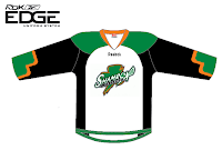
Chicago Shamrox set


I always liked the look of the Chicago Shamrox of the NLL. The jersey's were a little bland but nothing severely dull. Too bad they only lasted two seasons. I've been keeping an eye on the league website as well as it's Twitter and Facebook pages for expansion news. That isn't likely. In the mean time I'll be back soon!

-Ricky

13 July 2012

More Buisness

All-Star festivities for my guests may have ended as one has left, but the 22nd Macedonian Ethnic Festival at Sts. Cyril and Methody Macedonian Orthodox Church in Blasdell, NY kicks off at five today. For info, you can visit the Sts Cyril and Methody (Blasdell, NY) website. Below is a concept I created in December of last year. it was submitted to HJC as well.

Team Macedonia
The festival has visitors from around the US, Canada, and occasionally native macedonians who happened to be on vacation in North America. Most of our Canadian friends are from Southern Ontario. Outside of Buffalo, NY and Erie, PA we have been visited by droves of people from Cleveland/Ohio, Floridians, Chicago/Illinois, Californians, and the large populations in Indiana - just to name some. After Sts. C&M (Blasdell) hosted their first festival in 1990, St. Dimitrija in Henrietta (Rochester, NY area) and St. George in Syracuse (NY) followed suit. I know Ryan from HJC is close to here, but that's it. So I'm signing off for now.

-Ricky

12 July 2012

The Silver Jubilee

It was yet another great night to watch baseball in Downtown Buffalo yesterday evening and festivities were in abundance. The game itself was a rather boring game, but for any fan it was worth their money. I was able to take in some of the sights and sounds below . . .

The first pitch.

The Cone Head


The Herd.


Special Appearance by the Earl of Bud!

The man on my farm, one of the best farms in baseball.

Title screen

This . . .

. . . plus this . . .

. . . equals this.

Wil Meyers (Omaha Stormchasers) and Matt Harvey (Buffalo Bisons) are the Pacific Coast League and International League champs, respectively.

The grand finale!
I was disappointed that my dad needed the camera. I knew if I gave it to him, I would be missing some of the things I wanted to capture - including the introduction of the Earl of Bud. Oh well, many others got to catch it! The whole Bisons staff did a magnificent job putting these events together and I look forward to more!

-Ricky
Creative Commons License
This work is licensed under a Creative Commons Attribution-NonCommercial-NoDerivs 3.0 Unported License.