31 May 2012

Are You Ready for Some Football?!

The first of football templates are here, just as the basketball ones from yesterday, this is recolored. This time, the source is from our plas at the Paint User's Paradise 2.0 on CCSLC. Here you are:

American football template.

As usual, when there is a new concept up, there is a first design to display the features of the template, usually using my favorite team in that sport. The following Bills design is intended as a home jersey, the ensuing home and alternates will follow tomorrow.

The first ever "Red" Bills jersey.

The only thing was I wasn't at home again as you'll notice the striping on the helmet side view. Also I couild have replaced the white on the face mask used for the shade of blue on the helmet. That will do for now, I have to get going on the rest of these for tomorrow. Sayonara!

-Ricky

30 May 2012

Basketball or Bust!

Hiya, I've upgraded a basketball jersey template to my liking and voilá, here it is:

My adaptation of a hoops jersey.


Football template(s) will be next - I hope. We'll get back to Basketball in a sec. Anyway, HJC saw a milestone occur yesterday - the first ever perfect rating under Ryan Haslett's new critiquing system. It was achieved by Justin Cox with the following entry.

A capital idea.

Back to the hardwood, I designed a new Pacers set because I don't like how the NBA has faint gray vertical dotted stripes on all of their jerseys now. However, the stripes the Pacers used to have, particularly the yellow third were pretty sweet.

Triple stripe jersey.

Single stripe jersey
The yellow alternate.

I had a lot of fun with this, so expect some more later. Until the next concept . . .

-Ricky

29 May 2012

Blue Jay Way in the U.S. of Eh?

IN accordance with yesterday or my trip, this has nothing to do with either . . . I was on Chris Creamer's Sports Logos surfing for a  non-hockey crossbrand to do and i felt the "new-look" Jays were the perfect guinea pig for it. Although I did feel that I might need to redo it since I'm at my grandparent's place again! But for now, It looks decent and presentable.

A second team in Toronto?

We still don't know if any rumors of Toronto (or Hamilton) are true, however it's highly doubtful due to the strong Sabres and Leafs fan territory in Southern Ontario. Either way, I think we all know that the Next city to get a pro team will be Québec City with the talks of a potential new arena. That's all I have today . . . à tout à l'heure!

-Ricky

28 May 2012

An Idea from Ikea

   Hello all! My "Toronchester" excursion led to this post today, after an exciting stop at U/Toronto's Varsity Centre (and the ROM - Royal Ontario Museum), I headed off to Toronto F.C 's home - BMO Field. In person, I had only ever seen it from the Gardiner Expressway (and of course on TV) until today. I always thought it was a small capacity, well maintained stadium - which it is. However, the stadium gift shop is inside of Gate 5, the ticket/info offices were all closed, and you could hardly see the interior. In fact, you could probably see more the way I usually do when I'm in town: passing it on the Gardiner. Oh well, eh?

   Anyway, it was nevertheless a great way to relax following a graduation at Keuka College in Rochester then a wedding in Toronto. As a result of all the driving, my folks and I stayed the night leading up to this wonderful "vacation day." We left Toronto for Buffalo right after the visit to BMO Field, but that included a stop at Ikea on the way  in Burlington as opposed to the location in nearby North York. There I saw their uniform polos which look similar to the jersey below, except the colored stripes were much thinner, still larger than the white stripes between each. Therefore, there were more of the whole set of stripes around this yellow polo shirt. Not to mention the shirts were single colored last time I went to any Ikea.

The "Ikea" jersey.
It had been awhile since my last visit across the border as we used to cross more often. These instances were most notable for family functions or shopping when the exchange rate was very inexpensive (anywhere up to 2004. It should be more because I'm into curling as much as I am. However it has been difficult to go seeing as I'm a college student now who isn't home and the curling clubs close for the summer. Well it's time to go for today, auf wiedersehen!


-Ricky

27 May 2012

Strolling in the Park One Day . . .

You should have noticed the improvements on the site within the past week. We are now Twitter and Facebook accessible, I have added various tabs to keep you busy, The "NHL Third Jersey Hall of Fame will be inducting on the 14th of June, and much more! You can translate the page to the language easiest for you if you aren't a native English speaker.  I just wanted to make you aware! Don't forget to send in any ideas you have to us and comment on posts to voice your opinion!

I made a change due to a request by Ryan from HJC:
Revised
I'm not home at all today, so this will have to do. Mondays post will be later on in the day. Au revoir!

-Ricky

26 May 2012

The Highlight Factory

It might not be pretty, but Atlanta will get a third team for the 2012-16 season. At least according to commissioner Craig Harnett it is. If you haven't realized, this is written from the perspective of the Islanders expressed interest to leave Uniondale. I did ultimately decide that Atlanta was the way to go - and if your read the bottom of the concept, you'll see why.

The Islanders, due to relocation from the Island, change the team nickname as well.

This idea is unveiled as a combination of Atlanta's hockey past and future. The colors are similar to those of the Atlanta/Calgary Flames and "ATLANTA" runs down the side of the opposite sleeve than the original versions of the turbo blue Thrasher jerseys. But yet it still has it's own identity. I didn't realize the Flames thing until working on yesterdays pre-concepts and then decided to make it more Atlanta-esque add the "ATLANTA" down the right instead of left. As far as futuristic (more-so a "C-Kings look") look is concerned, I took Pittsburgh Penguins striping and added that . . . could this striping have worked for Vancouver (with exception of the "ATLANTA" sleeve)? Maybe that's something for me to think about.

Well, love it or hate it, there she is - my Islanders relocation concept. Don't forget to tell me what you think by clicking on "Comments" below. If you have any ideas and want to send them in, e-mail us at BNGraphics and we'll post as expeditely as possible. Remember different channels equals different audiences, different audiences equals more views, so make yourself known!  Bye for nhow.

-Ricky

25 May 2012

Cotton Kings Prevail?

Sorry, had to be early today since my day will be changing on an hourly basis. But I do have home and roads, though I considered a yellow/gold alternate, which is still in base planning.

Home                              Road

Kind of reminiscent of the Flames, no? The C-Kings don't look bad here. All thanks to Eli Whitney, the original cotton king, for inspiration? Not quite. More-so the Thrasher fans throwing old jerseys on the ice in Nashville as far as the relocation part is concerned. The Wheat Kings nickname seems to be embraced in Brandon, MB of the WHL very well . . . Anyway I'll be back tomorrow!

-Ricky

24 May 2012

Gandma's House

As you may have noticed, I am not at my normal computer, as the title suggests. Therefore I do not have access to my concepts or programs. When it's done, I'm sending in my NY Islanders Relocation concepts, for the current contest on HJC! In the mean time, you guys are getting a look at some of the ideas. Not all are final products for location and or nicknames.

The first pair are visible below:

Atlanta gets a third team.

or

Inspired by Fort Knox.
Bye for now!

-Ricky

23 May 2012

Mom's Birthday!

Congrats to HJC on the unveiling of their (produced) jerseys today!

The first batch of HJC's jerseys have arrived!
I have intentions of ordering one of these myself, until then, I will keep dreaming. It Looks much better than "in development" to be honest, prior to that, I was very opposed to the crest logo. But this certainly looks better then when it was drawn up!

My rendering of what should have been the HJC official Jersey.

I submitted the above a few months ago, when the design contest was afoot. I was the first of few entries to feature a "red" jersey.the striping here was inspired by the stripe on the crest logo above in the actual jersey. as much as we typically don't like circle logos on hockey jersey's, I feel that this type of striping adds character to this crest logo. The striping was also intended to be a hybrid between Montréal's traditional striping and the striping from the 1997/98-2002/03 red Senators jerseys.

Meanwhile, Weber State (finally) brought a new look to their athletics program! It looks much better than the old one. It was decent when superimposed, but since detail often wasn't visible from afar, it wasn't as impressive. But this was definitely a great step forward, and into the future.

Sorry to be disappointing in regards to new content, but I had to take the day off since my poor mom had her eye scratched by a contact last night so she's been home on her birthday today.

Happy birthday, mom!

See yinz later.

-Ricky

22 May 2012

An Hour and Twenty Minutes Later

Much to my dismay, I didn't post when I planned to today getting caught up in my "casual reading." For the record, I'm trying to post between 11:30 AM and 2:30 PM so that everyone within my immediate audience (-8:00 GMT to +1:00 GMT) which gives me between 8:30AM PST/PDT and 8:30PM CET/CEST. Hopefully you haven't forgotten to send me any concepts you may have to submit - don't forget to include your name when sending your very first concept to BNG. If you want to explore a bit more, check out the other tabs on BNG!

Anyway, I promised a continuation of the "Un-Arsenalization" project in which I have added elements form the other emblems of the Barclay's Premier League's "Big 4" clubs. I decided to take on the Manchester United spoof of Arsenal. In the overall set of logos, Man U has the best of the conversions of the other clubs in my opinion.

A triumph of Arsenal spirit.
Well, I best be off fot today, as I need to work on a project for the near future . . . à bientôt


-Ricky

21 May 2012

All About the Arsenal

The Arsenal Football Club (C'mon you Gunners!) of the Barclay's Premier League soccer recently unveiled their new home kits for the 2012-13 season! You can give the site a gander here.

(L to R) Theo Walcott, Lukas Podolski, Mikel Arteta
These  are inspired by Herbert Chapman, who from 1925 until his death in 1934, managed the club and in now enshrined alongside Thierry Henry and Tony Adams outside Emirates Stadium. Arsenal are my favorite English side in soccer, and as I was looking for a site I hadn't been in a while on Google image search I came across this:

I'd love to give credit to the original artist, but the article it was linked to removed the image.

It gave me the idea for the next few posts as I present you concepts based on these drawings. The Arsenal logo in Column 1, Row 3 will be featured today.

Stealing Liverpool's identity!
The runner set should remind you of the days when O2 was the sponsor (2005-06 version). As far as the keeper set, there has always been a kit in some shade of green, though never this bright. That'll do for now - see ya!

-Ricky

20 May 2012

Battle of the NLL Concepts

I decided to put the concepts together to decide the best one.  Teams were seeded by this year's playoffs. I actually didn't have much trouble in determining, as I knew not all of them were "stellar" as I would have hoped. The First round match-ups are as follows:

Edmonton Rush @ Calgary Roughnecks


Buffalo Bandits @ Toronto Rock


Minnesota Swarm @ Colorado Mammoth


Philadelphia Wings @ Rochester Knighthawks

The next round saw the following pairings:

East Division Final - Rochester @ Toroonto

West Division Final - Edmonton @ Colorado

The championship was between Colorado and Toronto.

Mammoth @ Rock for the championship

Bracket overview

A simple post for today, in terms of wordage, but many photos today (twice as many from yesterday). Later gators!

-Ricky

19 May 2012

A New Champion is Crowned!

We new that were were getting a new champion, after last weeks matches.

Image courtesy of NLL.com 

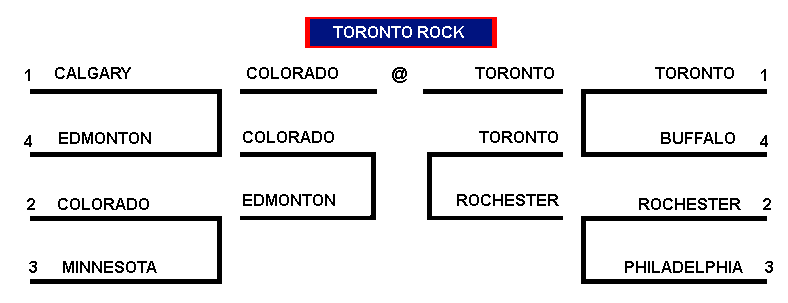
     Lets start in the East, where the Rochester Knighthawks hosted the Philadelphia Wings in the opening Round of these 2012 playoffs. In perhaps the toughtest matchup between these two this season, the K-hawks staved off the Wings in a 14-13 affair with the Wings not beating the Hawks once this season in four meetings. Toronto beat Buffalo at home 7-6, holding the Bandits scoreless in the second half. That meant that Rochester would have to come to the Air Canada Centre, where they had never won in the postseason. 11-7 was the score in favor of the team in teal after three quarters, but four goals in the indoor game is nothing because indoor lacrosse is a game of runs. Then on two separate occasions, Rochester would have three goal runs, their only six of the quarter. Their six were interrupted by two Toronto goals before Toronto went on a 4-0 run which wasn't enough to win the game as those Runs by the K-hawks had them up by at least seven twice. Rochester now knew that they would play in the championship game, but who and where was still in the air.

     In the West, fourth-seeded Edmonton had the worst record of the playoff teams at 6-10 and went in to Calgary for one final Battle of Alberta for this season. Calgary had won all of the regular season match-ups and are 22-4 in the regular season. But Edmonton reminded the Riggers of their playoff troubles when hosting the Rush two seasons prior. The Rush had book end quarters (1st and 4th) against the 'Necks, ousting them  11-3, with a pair of four point advantages (6-2, 5-1) to demolish the hosts 19-10 (Note: This is the Rush's best performance in any game of this provincial rivalry). That indicated that Edmonton would have to travel not to Colorado, but to Minnesota, as the Swarm upset the Mammoth on the road by a 14-10 mark. Minny must have overcelebrated their first playoff win in franchise history, because the Rush silenced the Hive  by netting 10  in a row to make the score 11-1 at half. Minnesota got their defense to wake up quite a bit, but continued to sturggle offensively. The end result was a 15-3 swatting of the Swarm by Edmonton.

One night, one team, one champion. The Champions Cup final is next!

I traced over Chris Fox's image in a new layer and deleted his original
It was definitely a tale of two halves as it seemed like it might be somewhat close to the end. After a 5-1 half-time score to Edmonton, it seemed like they might put up another fantastic offensive performance, but the Hawks in the second half went on to score seven unanswered goals, leaving the Rush scoreless in over 26 game minutes, then the teams would exchange goals for the final tallies of the game at 9-6. The Knighthawks come to claim their 2nd title in 5 years, and third in franchise history. Cody Jamieson was named the Championship MVP with a total of eight points on the night.

So let's discuss the runner's up, the Edmonton Rush

Oilers colored Rush concepts.


This set is better executed than the Bandits jerseys I put up earlier this week. That's because I realized that I should have done the home jersey similar to the original and 20th Anniversary jerseys, which I will work on right away. But you will notice (or not) that I used the number set from the back of every MLS uniform. The name font, I felt was the closest match to the logo's font, actually taken from a Price is Right  pricing game - I can't remember which one specifically. One could say, that the Titans returned to the league, lol.

The 2012 NLL champions are the Rochester Knighthawks.

an I-90 Knighthawks concept.

The champs were fashioned with a kind of "Interstate-90" look, so named by myself because the criss-cross design on the shoulders of the home and roads come from Edmonton's birthplace - Syracuse, NY (the next town over about an hour away)- ironic enough for you. The Smash's then colors were powder blue and purple, so that was the top of their only jersey (at least the only one shown in old team highlights). The third, however, is a modernized version of the original Rochester third jersey. An almost identical replica is shown with the exception of a white strip running between the black and teal and no extension of the shoulder yokes further into the body. If the number font looks familiar to any MLB fans, you might recognize the Washington Nationals numbering.

For the record, both mayors made a gentleman's bet. Whoever's team won, the opposing mayor had to wear the winning team's jersey to their next city council meeting. Good luck with that Stephen Mandel . . . but Mandel and Thomas S. Richards also agreed to supply gift baskets of local intricacies, no matter which team was victorious.


Tomorrow I am going to do a sped up version of the jersey playoffs, then you can create your own road to jersey heaven. Great job to Edmonton on making their first finals appearance. Congratulations to Rochester on winning this year's Champions Cup (though I still don't like them with a passion and the Bandits still have one in hand). See you sometime tomorrow!

18 May 2012

History was Made

This past weekend in indoor lacrosse was monumental for both of the divisional finalists. The older of the two teams, Toronto,  had been 4-0 at home against the Knighthawks and 5-2 overall (1-2 in Rochester) despite never having one a game at Blue Cross Arena at the War Memorial during the regular season until last season. All the pressure was on Rochester, especially since the first two meetings at the ACC were the 1999 and 2000 Championship Games. It was even further emphasized that the Rock were the defending champions and probably could have lost to Buffalo (not to be a homer). If the Bandits won over Toronto, it would have ended a five year meeting drought, when Rochester won the Champion's Cup in 2007.

Red replaces black.

Toronto typically has good thirds, and the current set is the best they've had. But I wanted to see a red third to replace the current black ones, yet two alternates would be cool . . . the Bandits did that this season. I didn't notice until after I finished, but the numbers are the ones from the original Blue Jays uniforms. The design down the sleeves was inspired by Team Canada Curling from the 2006 Winter Olympic Games in Torino, IT. Either way, this could "blend in" with the history of Toronto Rock jerseys However, the red alternate here reminds me of a Hawai'ian jersey they had a while back. Then this one used to be the third jersey - it was red instead of blue at the bottom of the home whites.

Meanwhile back at the hive, the Swarm clinched a home playoff win after beating Colorado for the second straight week - this time at home. These two met at the Xcel Energy Center in Minneapolis the week prior when JGJ broke the single-season scoring record (as mentioned on Wednesday).  This was Minnesota's first playoff win in franchise history. Two losses to Buffalo (both road losses) and a home loss to the New York Titans covers 2006-2008. A one year absence during their first West Division season was followed by two straight losses to the newly relocated Washington Stealth last season and the season before.

I wanted to toy with Minnesota Wild Colors


That brings us up to date - leading up to last weeks home game against the Rush, following the first ever playoff win, much to the delight of the Arlotta family, who owns the team. But we are very looking forward to the Rush at the Knighthawks tomorrow night! Surprised by this concept? I decided that I needed to change some color schemes after reading a blog post about how there is too much black and red in the league - which I tried to use as the epiphany for my concepts wherever possible. Recognize the sides? It should remind you of this year's All-Star Game threads. Don't forget, Saturday's post will be up after 9:30 PM EDT (-5:00 GMT) sometime, when the new league champ is crowned. Well I've gone over everything I wanted to take care of. In the mean time, so-long for now!

17 May 2012

Bring Back Derrick the Driller

Its tough to beat a team five times in a row in the sames season - especially when it's the Battle of Alberta, as the Calgary roughnecks could not win their opening round playoff match against the Edmonton Rush.

Despite it's success on the floor, the financials off the floor were a scare to the Calgary Roughnecks, their fans and the league. That is until the team was (finally) sold by Brad Bannister to someone (after trying to find a potential investor for over a year). To that point, they had won in 2004 and 2009 - their only two championship appearances. Then many Riggers fans said they took a change for the worse. Particularly the changing of the mascot to a honey badger prior to the beginning of this season.

The team has never finished below third in the West in any season and have made the playoffs every year except for the team's inaugural (2001-)2002 season. This was one of few seasons that started before New Year's Day, specifically November 16, the earliest to date.

The concept may seem bland at first, but upon a closer look, you will see layered bricks along the sides of the home and road jerseys.

A better Necks concept than I originally anticipated in development.

Now that that has been taken care of, I can safely wait until tomorrow to talk about our Division Finalists. Later!

-Ricky

16 May 2012

Mammoth Refreeze

The Colorado Mammoth have seen better, but a dismal second half of the season didn't help. It seemed like the Mammoth would come out of their deep freeze from the bottom of the abyss - the worst two seasons of the franchise's history prior to a home win against the Riggers on the final day of the regular season, the mammoth hadn't won in 9 home matches. That's more than one season's worth in home games.

Calgary one upped them again this year, despite the 7-0 start to the year and boasting a 7-1 record into the All-Star Game in Buffalo and a trip to Buffalo the following week, after a win at the First Niagara Center began their troubles. To make matters worse, they lost to Minny at the Hive in Minneapolis on the final week of the season, although  John Grant Jr. broke the single-season scoring record - much to my dismay. The decade old record set by John Tavares in 2001 at 115 was done in fourteen games, as was this since Grant missed the first two games to injury.

Not only did this loss put them a game behind the Necks, but they had to play the Swarm again. Two things were on the bright side at this point: 1) The Swarm have never won a playoff game {having been dismissed by Buffalo when they were still in the East} and 2) The game was going to be at the Pepsi Center. Beating a team for a fifth straight time this year would have been amazing. But Edmonton had shocked Calagry from the Scotiabank Saddledome so this set up the winner of this match to clinch a home game. This helps Colorado, because their fan base along with Buffalo are tops in the league (in no order) and would potentially get two more home games if Toronto loses the following week to Rochester.

To think that Colorado could still revive their glory days of the mid-2000s, and they choke. Based on the above, we should get to their new sets (if only)! The concept adds Avalanche blue due to the enormous amount of black in some of the leagues other current color schemes. Don't forget to tell me what you think!

Avalanche Blue is added to the color scheme.

I feel that the blue adds more character to things. The mountains at the bottom have been revised a tad and added to the shoulders of the thirds as well. This is one of my favorites in my NLL collection  and was the first one I did. As a matter of fact, it was what inspired me to create the collection. Tomorrow, don't forget, will feature another Western division team in the Calgary Roughnecks. Until then, star sending in concepts. To find templates visit the first post with the NLL 2012 RBK template and/or visit either HockeyJerseyConcepts: TEMPLATES for hockey templates (and/or) Paint User's Paradise 2.0 @ CCSLC for whatever you wish to. If you have made your own template, send it in to me at Buffalo Nickel Graphics. At some point, when I figure out how to add tabs, I will post the templates there . . . I think that's everything so I will be back for tomorrow's post - toodles!

15 May 2012

Wings Over Philadelphia

The Wings made their first playoff appearance since the 2008 season, the last time they had a winning record. This is the second post-season appearance in a decade, when they finished 2nd the East division in 2002. Prior to Toronto's championship last season to tie the record, Philly had won the most championships with six.

Because of their losing ways, the Bandits are just six wins behind the Wings in all time wins (regular season wins), though the Bandits have won two more games than the Wings in the playoffs. The last stat is helped by a 4-3 record between the two in post-season play in favor of Buffalo, including 3-1 in championship games.

Enough stats already, lets get to the concept!

I wanted to see a grey/silver jersey in at least one of my concepts.

The grey jersey was a member of the Philadelphia kits for a long time, though not this fictional concept. At least this allowed me to use it as a home jersey instead of a road or alternate.

Don't forget about the revelation of my Colorado Mammoth concept tomorrow and send in your own concepts as well to bngraphics2012@aol.com! In the mean time, I'll see you soon!

14 May 2012

Getting ready for the NLL Championship

Okay, this was the big project I have been working on over the last few days . . .

It is all about the National Lacrosse League this week with today being focused on the Buffalo Bandits.  This would be the second in the series, and I hadn't gotten to post the first of the series for yesterday (Washington). Both will be featured today! The home jerseys will always be top left, the roads top right, and the alternates bottom center.

The Stealth were the only team to not make the playoffs, that's why they are the first in the series. The timing of the ideas forth is concept was ideal, though I noticed that this morning. I decided to bring the "snake-eyes" ninja back to the Stealth's original look in San Jose after their tenure as the Albany Attack. This re-brand (logo-wise at least) would be nice to see.

"Snake-eyes" logo added to current script logo.

I tried to do better with the numbers, but I couldn't find anything that I liked in my font library. Otherwise, this might be a solid concept.

Edmonton should have been next, but their re-brand will be saved for the Finals on Saturday with Rochester. The Bandits concept was very difficult, in part because I'm a fan and because their uniforms (past and present) have always marketed well - so I was very skeptical about this one.The only thing that would be of huge note is that I tried to incorporate more of the indigo from the color scheme in somehow. I seemed to manage alright considering.

My somewhat retro-looking Bandits, considering the original jerseys.

If anyone was curious, I felt the need to let you in on my process of designing the typical jersey concept. I also promised that I would do a video of the first of them. Buffalo happened to be the first of the cities alphabetically.


That will do it for today. Tomorrow will feature my concept for the Philadelphia Wings.  The rest of the week will look like this: Wed.: Colorado, Thurs.: Calgary, Fri.: Divisonal Finalists - Minnesota and Toronto, Sat.: Championship teams - Edmonton and Rochester.

The champion in the post Saturday will be posted last, therefore indicating the post may not be done until after 9:30 PM EDT (-5:00 GMT) after I have completed watching the game. It may be later than that as I am trying to see if I can go, since the match is in Rochester and tickets are only $21.50 USD.

For the record, I wanted to see what I got over the course of seven days in the audience tab, and quite frankly I'm very impressed. Keep coming back and thanks for your  support!

Last weeks numbers.


In the mean time, I will be dreaming and working up some new ideas! Until tomorrow!

-Ricky

13 May 2012

For Mom's Day, Spring Colors

I know I didn't get this in earlier as I hoped, but for simplicity sake I will keep it short and sweet. Don't forget to wish your mother Happy Mother's Day, either, if you haven't yet!

This one wasn't my favorite, but in trying to be unique, I tried to use atypical colors (although the idea is based off of the original scheme and look of Australian football's Fremantle Dockers). This was entered for an AHL relocation concept - as the name and number imply, this was from August last year.


Portland (OR) Dockers, the to be affiliate of the Vancouver Canucks

So I will have something up for tomorrow, in the mean time - toodles!

-Ricky

12 May 2012

New Look Leafs?

It took me most of four months, but I finally finished this concept . . . It was for a contest regarding teams that didn't have third jerseys, but this one wen't in another direction. The black third for Toronto would be the first one ever for the franchise, but I also just did the third one in five minutes after a copy, paste, and paint job. This was tonight, by the way.  But there is another one from late December that is in the works as it revolves around the Jackets.


My mashed-up Leafs concept.

For those who haven't realised, I made a mistake in the e-mail. The correct e-mail to send in concepts is the following: BNGraphics.  The other address doesn't operate properly. If you have sent concepts to that address, please e-mail them to the new one! The next time I put up a brand new conept, I will try to put up a time lapse video if you want to venture how I work with my ideas. Until next post!

-Ricky

11 May 2012

Ross Taylor Contest?

The first contest of the history of BNG may be possible, it might revolve around concepts by a gentleman named Ross Taylor. If you want to see the designs based on his concepts  the following link will display them: Ross Taylor Designs


Image(s) courtesy of Ross Taylor.

My personal favorites are the St Louis, NY Islanders, New Jersey, and Colorado concepts. To make a top five, the Oakland/San Jose concept gets an honorable mention.  Tell me what you think? Or something like that. TTFN!

-Ricky

10 May 2012

Sonic the Hedgehog and Co.

So here's my video game concept I promised to post.  I took Sega's Sonic the Hedgehog series and did something with it.

The contest required me to put a description, even if obvious.

This one took me somewhere I wouldn't have expected to go, maybe I should come up with more similar concepts in the future . . . There was an AHL "half rebrand" because the voting on which should be done on HJC was tied . . .I wasn't happy with that, so I didn't enter because my entry was rendered useless.  However, he did post my concept anyway. I turned it into a video as seen below.


Notice I added the stripe from their Inaugural 3rd then road jersey.


As a random concept, I once sent in a Calgary Flames inspired Chicago Fire jersey it looked something like this.


The only resemblance to Calgary's sweater is the side piping

I also created one for the 10th anniversary for 11 September (a Columbus Crew concept), but that will obviously have to wait for said date.  In the mean time, I'll be back soon!

-Ricky

09 May 2012

Should Winnipeg Have Made the Playoffs?

Here is a concept that really grabs my attention from my portfolio.  The Montréal Canadiens of the NHL have never donned a blue sweater and a similar stripe version to my white one has only been used during three seasons (03/04, 05/06, & 08/09). That is why the red serves as an alternate, since I am kind of tired of it although I adore the set's simplicity.


The following was my very first concept and first contribution to Ryan Haslett's Hockey Jersey Concepts. They are currently running a Video Game jersey contest, so I will post mine on here once it has been submitted to HJC. But the below concept was prior to the naming of the Winnipeg Jets after the team had moved to Winnipeg. I wasn't sure if they would do what the Flames did and keep the nickname when they moved to Calgary before the 1980-81 season. I didn't think that the "Jets" nickname would be retained because it is associated with the (now) Phoenix Coyotes. This is what I came up with. Looks pretty cheesy doesn't it?


Then a group of fans protested the move to the W-P-G at Bridgestone Arena during a Jets road match in Nashville this past season.


I think I've given you enough to think about, until next time!
Creative Commons License
This work is licensed under a Creative Commons Attribution-NonCommercial-NoDerivs 3.0 Unported License.